Today let’s continue with the color mixing series! I’ve featured examples of decorating with monochromatic color and decorating with complementary color recently, today the focus is on analogous color mixing. Analogous colors are those adjacent to each other on the color wheel and these examples below show this method of mixing color is another no fail way to combine hues in successful pairings by partnering your color of choice with its closest neighbor.
Using complementary colors often adds energy to a space because your mixing opposites on the color wheel, a cool color with a hot/warm one. Decorating with analogous colors can either create a soothing space when the hues are pale, muted, or cool tones, or the technique can be invigorating when the analogous combinations are bold, saturated, or hot colors.
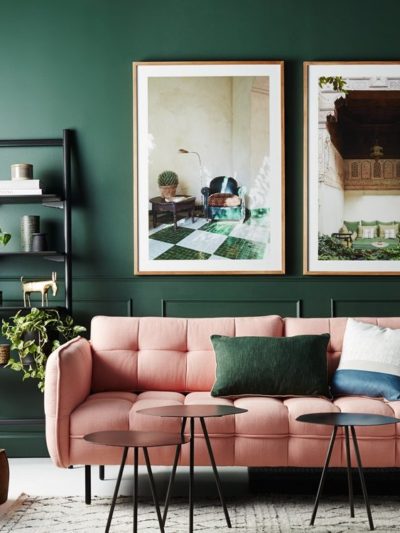
A popular analogous color combination is blue and green, the colors reminiscent of the sea, sky, and the botanicals we are drawn to in the great outdoors.


better homes & gardens

rachel reider


Violet sits on the other side of blue as its neighbor so shades of purple or lavender always play well with blue hues.

Things get exciting when a third analogous color is introduced into a space, for example look at the green + blue + violet medley. The blue plays middleman while green and violet accentuate, deep saturated hues make a bold statement, lighter or muted shades combined with neutrals or white are more subdued.


Any color can be the center of an an analogous color trio, below are examples of mixing green + blue + yellow.

rachel reider

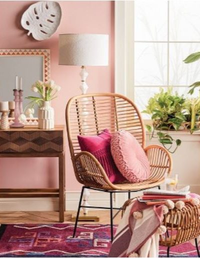
Pinks and oranges are hot colors and attention grabbing indoors just as much as they draw our eye in nature (think sunsets and summer garden beds in bloom). A vivid pink and orange combination will energize, a mix of paler tones like blush and apricot is a softer more soothing approach.


Decorating with analogous colors is a favorite of mine in my own home especially the blue and green medley, I never get tired of it. What’s your favorite analogous color combination?
..

I love the pics of the blues and greens mixed together. I find myself drawn to blue more than ever before but green has always been my “go to” color. It’s great to see some examples of them mixed together so nicely. Nice series. I have also been drawn to mixing beige and grey together. I know the trend has really gone toward grey lately, but I just can’t give up my beige. Sort of like asking me to give up black clothing…what would I wear? Can you do something with mixing beige and grey together for a current look?
Great examples of how to mix analogous colors. This article gives me some clear direction for my dinning room! Thank you!
I love the blue/green/lavender scheme in soft colors. I used it in my last office and really want to redo the current one but haven’t gotten to it yet.
I’ve got blue/teal/lime green/marigold going on in my living room and gray/steel blue/cream in my master. This happened totally on accident!
I love all these spaces! I’m a big fan of bright colors and I love the pop of yellow and blue in some of these pictures. Thanks for sharing.
The Office Stylist
http://www.theofficestylist.com
Wow I love the color schemes a lot of them are not some I would have thought and that great. My house is mono-color so this gives me a lot of nifty ideas
My bedroom has green walls (meant to help you sleep well) and I have been wanting to spice it up with blues in the doona cover. Just looking for the right one so thanks for the inspiration.
Can you help me find the source of the curtains in the blue BHG picture? Thanks!
Hi Carrie, I’m not sure of the source of the floral fabric in the first BHG picture but in the second it’s a Braemore pattern (one of my favorites) found here:
https://www.fabric.com/buy/0349010/braemore-gazebo-blend-cloud
Kate
I really need to remember to read your blog every day! I decided to check in on you today and was happy to see your most recent posts regarding color theory and color schemes. I am in the midst of putting together a presentation for a moms group tomorrow night. I’ve been asked to give a little interior design presentation, and lead a creative activity of making Mood (or Inspiration) Boards for our homes. Honestly, I’ve never made a true Mood Board myself (although, I’ve put together many materials boards). I was hoping to find some Mood Board inspiration from you on your blog ;)
Email me Sarah, I’d be happy to help.
Blue and greens! I just love these paired together. Nothing seems more peaceful than a blue and green bedroom.
I have a lime, yellow, orange thing going on in my house, with small snippets of red and brown. It is energetic, but couched in a lot of white, also surprisingly calming.
I have a lime, yellow, orange thing going on in my house, with small snippets of red and brown. It is energetic, but couched in a lot of white, also surprisingly calming.
Love the deep greens with the blue walls in the first image! The entire room is gorgeous and very soothing. Great article, I really enjoyed reading it and it inspired me.
Sue
Thank you! That is so helpful and kind of you to take the time to reply. It makes me love your site even more!