Do you ever look at a space and love it but feel overwhelmed in trying to recreate it? Often it’s the designers mix of pattern and color but there is one way to simplify the process and that’s with monochromatic decor.
A medley of color is wonderful, but so is tone on tone or single palette styling. You can get away with a mix of pattern and style – abstract, traditional, contemporary, large and small scale, it all works when your palette is limited to one color. These neutral spaces are great examples of how calming an edited single palette is.


Blue and white never goes out of style, mimic a retail styling trick you often see in catalogs by pairing multiple prints and accessories in a single colorway. Keep it classic by sticking with one blue hue or mix in lighter shades of aqua, paired with natural textures the medley creates a chic coastal vibe.


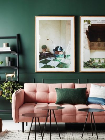
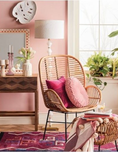
If there’s a color you adore, let it take over a living room, home office, or bedroom.


I love a space that owns a color like an actress on the red carpet, and a powder room is one place to pull it off with flair.

house beautiful

lt’s inspiring to look at new outdoor furniture when it’s released each spring, some of the styling is monochromatic to showcase the collections. One palette decorating works beautifully outdoors too!

frontgate (spring 2015)


Monochromatic color is a no fail way to layer a space with multiple patterns that work together, have you tried it in your home?
…

I like the color of the mabley handler. It seems be tiffany blue.
I really love a monochromatic colour scheme as it is for the most part calming and soothing although the hot pink bathroom/powder room above does not fit the bill! I lead a very busy life and my workplace is almost frantic so I appreciate a calm space where colours do not vie for attention. Lovely pictures in this post Kate.
Love each and every one of these!
Oh my goodness! You find the BEST pictures for inspiration. I don’t know how you do it! I love that you give me a new perspective and gets me out of the rut of being attracted to the same things. I love that bright blue grasscloth in that dining room. The taupe beige built-ins are divine. Thanks for the great inspiration as I move forward designing our entire house. I’ve already pinned these for future reference.
Nancy @ Slightly Coastal
Love the green herbal print wall
Love, love, love the Tiffany blue dining room!
When I think monochromatic, I automatically think all beige, or all white – which I’m not fond of – I love colour. You proved me wrong – so much beautiful colour in these monochromatic rooms.
Of course you would say blue never goes out of style HA! Happy weekend to you.
Nancy got it right – INSPIRATION!!! I found something in every one of those gorgeous pictures even though I would never do a blue room because I’m not a blue person. However, it was an inspiration pix that helped me design a delightful guest bedroom around an antique blue (greenish/bluish) secretary that didn’t work at all with my beloved green/yellow palette elsewhere. Most of the accessories came from what I had on hand and a lamp shade similar in color to the Mabley Handler pendant and some inexpensive curtains from Target were the among the very few new purchases. That inspiration pix is still pinned to the wall and I smile every time I walk into that room
Thanks for the reminder that monochromatic does not mean “neutral” or “no color” but rather taking one color and letting your imagination loose.
I’m not a purple/lavender fan either but those purple lanterns on the patio have given me a wonderful idea for my screened catio
Love this idea of letting the color take over the room! So long to the small pop of color. I have been wanting to do a full navy room and I am feeling more confident now!
Thanks for sharing!
Jill – setforthinstyle.com –
This could not be more perfectly timed! I’ve been stressing over our master bedroom because it’s currently all the same shade of blue & white. I haven’t loved any other color as an accent and maybe the answer is that I don’t need one!
Love the inspirational pictures. You chose one of my fav pics the dining room by Mabley Handler. This pic made me fall in love with blue bottles and vases. is there anywhere we can post pics for you?
Have a great weekend
Awesome pictures, monochromatic can be both calm and dramatic.
My bedroom is sort of morphing into a gray/steel blue theme. I love it.
Great pictures! Thanks for sharing!! :)