This is a post from a long time ago, but updated as of May 2013, just in case you’ve ever wondered about the colors on our walls . . .
______________________
I’ve received several emails lately inquiring about paint colors in my home. Shelley recently wrote,
“Dear Kate,
I’m curious if you would mind sharing the paint colors on your walls in your dining room, stairs, and entry? I so want to take my dated golden oak stair rail and replicate what you did with yours with the gel stain and glaze! Thanks for the inspiration…now only if I can get a dose of courage as well. I love your home! Simply beautiful ! ~ Shelley”
Sure Shelley! Some of the colors in my home are straight out of the paint can. Others I’ve tweaked by blending my own color.
In our living room is Benjamin Moore’s Affinity ‘Tranquilty’ but I had the guys at the BM store tweak it by pulling two drops of blue out of the formula to make it a hint grayer, so we dubbed it ‘Tranquility Tweaked’.
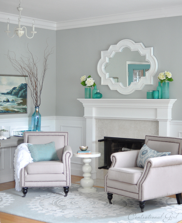
Here’s the formula for the Ben brand (which I love because it covers in one coat!)
S1 0x 3.0000; Y2 1x 1.5000; B1 0x 20.0000; O1 0x 19.0000
Here are three closest color matches to my custom formula: ‘Portico’ by Valspar, ‘Sea Salt’ by Sherwin Williams, and ‘Chicken Wire’ by True Value. .
.the the
The dining room, kitchen, and family room are all connected as open spaces so it made sense to paint them all the same color which is Benjamin Moore’s ‘Camouflage’ a pale gray green. It looks different in morning and evening light, a brighter green in direct sunlight and more gray in evening or indirect sunlight.

.
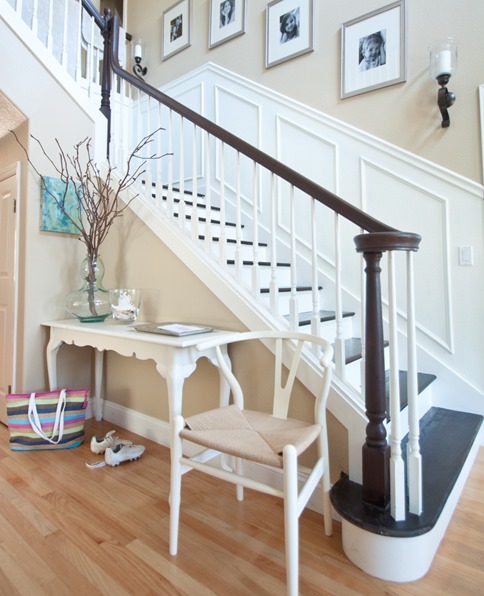
In the foyer is a neutral tan color we painted many years ago and I’m sorry to say, the name is not on the can because it was a custom color, but here are some close color matches: ‘Wheeling Neutral’ by Benjamin Moore, ‘Churchill Hotel Wheat’ by Valspar, ‘Whole Wheat’ by Sherwin Williams, and ‘Classic Taupe’ by Behr.
.
The kids’ study was recently given a makeover and the color is Glidden’s ‘Oyster Bay’

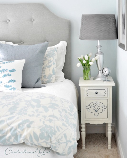
The master bedroom is another custom blend – it’s a mix of 1/2 Camouflage and 1/2 Misted Green, both by Benjamin Moore. The closest color match is ‘Comfort Gray’ by Sherwin Williams.

.
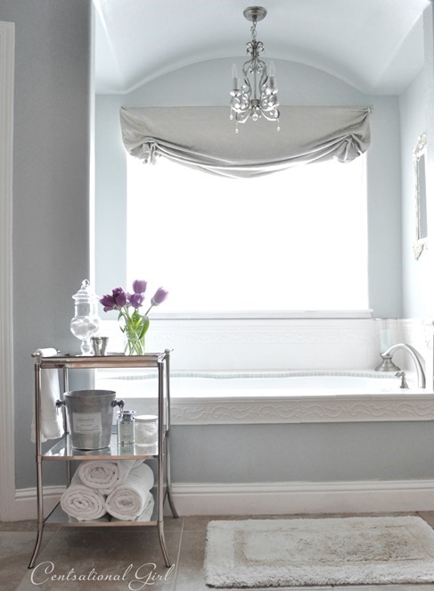
In the master bathroom is (shoot me now, I know) another custom color I mixed up with leftover paints …. but I’ve color matched it too so here’s a few close ones: Valspar’s ‘Clothesline Fresh’, Glidden’s ‘Grey Leaf’, and Sherwin Williams ‘Silver Mist’.
.
In my daughter’s room I painted the walls a pale gray with a hint of green, ‘Jade Frost’ by Glidden.

.
In my oldest daughter’s room which serves as a guest room while she’s at college, the wall color is ‘Blue Green Gem’ by Kelly Moore – a watery pale shade of Tiffany blue.
.
In the home office, I hung the grasscloth wall covering, but I painted the non-papered opposite window wall in a very close match by Valspar called ‘Seafoam Storm’ which is a really gorgeous medium gray blue. The back of the bookshelves are also painted with ‘Seafoam Storm’.

.
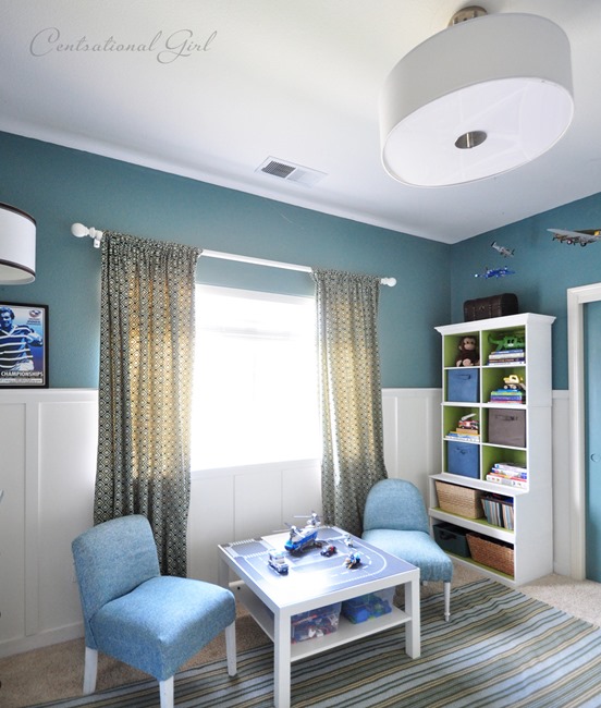
In my boy’s room, we painted his walls an intense teal called ‘La Fonda Villa Fountain’ by Valspar – it works well with the board and batten installation painted in Benjamin Moore’s ‘Dove White’.
.
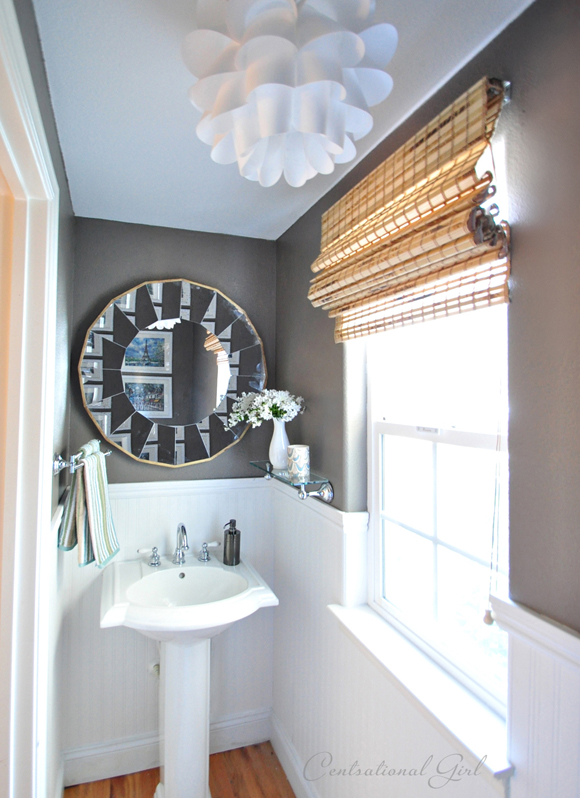
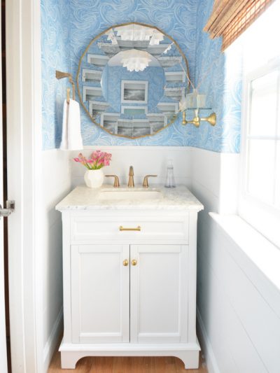
On the walls in my powder bathroom is Valspar’s “Seine” – a deep mushroom gray color with a little chocolate brown in it too. I also installed beadboard wallpaper for a nice contrast.
.
‘Silver Sage’ is one of those colors that you just can’t go wrong with ~ so it made sense to use it in laundry room, but I cut it in half with white to lighten it a bit.

So there you have it, for anyone who’s ever had any questions about the paint colors in the CG household. You can tell I’m a fan of blues and greens, as long as they are muddied up with gray. In my opinion, adding gray softens hues, reduces a color’s saturation, and creates a more soothing color, therefore increasing the chances you’ll be delighted with your color choice over time.
You can tour the entire house and see more pictures of our home here.
That said, regardless of what you choose, paint is simply the easiest way to transform the feel of a room. Yours truly is guilty of picking up the brush on many occasions and changing the walls in my home simply because the mood strikes!
.
.

A great blog post! We are re-modelling and I seem to be drawn to cream, but all different shades of it!
Totally bookmarking this too! We just found out that the Air Force is moving us back home to America, which means we will be buying our first house. I can’t wait to decorate!
Lovely to see your whole house!!
Love so many of the colors you picked…and what a great job giving us all several colormatches!
Great post!
I use many of these colors too. They are classic neutrals that go with so many decorating styles. You have such a beautiful home…I love coming to have a virtual visit :o)
peace.
You have a great eye for color. I love all of the moody blue-grays you’ve used throughout your house, and the fact that so many of them are your own creation! I am not brave enough to make my own colors. :-)
I am so glad that you did this post. I am leaning toward gray for my masterbedroom and bath. That is a huge departure for me. I have had Laura Ashley Gold 3 for about 10 yrs. (2 houses) and I am tired of it. I have also had taupe in our bedroom and office for about that long. (again 2 houses) I have a green kitchen with custom made cabinets hand painted in cream with a coffee glaze and I LOVE it! In the new house that we are moving to next week, I did espresso cabinets and a lighter counter. I haven’t decided what will go in there but I am loving gray for the bedroom. Thanks for all the color swatches. I have a bag full too and this post will be a good reference.
Concord Ivory is the paint color I picked to use in my kitchen! Glad to hear it results in the deep warm yellow tone I’m going for :)
I love this post! It is like a house tour – and your home is gorgeous!! I love that huge map in the playroom, and your kitchen is beautiful. What type of countertop is on your island?
Such lovely colors, Kate. I am with ya on the “five years and I’m over it” thing. I’m more of a three year limit girl. I love change, and nothing changes a room faster or cheaper than paint.
As usual, informative and entertaining post. I love the colors you have chosen. I will soon be choosing colors… however not much natural light so I will have to test test test… do you suggest funishing first , then matching? Also I noted we have the very same wood tone on our china cabinets (I have been thinking about painting mine!) but I like what you did on the insdie of it– did you paint it or is that paper? Thanks for your terrific blog!
I think those blues and grays are so serene and soothing. That’s a look I’d like to go for in our Master bedroom. Your kitchen is downright gorgeous. Our kitchen was the first thing I painted when we moved in 6 years ago, and I painted it yellow…but not a good yellow. It needs to go. I want something warmer, like what you chose for yours. Thanks for sharing all your paint colors! :)
What a lovely house! Thank you for sharing. I love your kitchen and am looking at counter tops for mine. Could you please tell me what yours are? Thanks!
Beth
Love your colors!!
These are gorgeous. I have the strangest shaped home in that first 3 rooms just flow into each other. I have lived here for 7 years and have not touched them with paint and it is driving me crazy! The foyer, formal living, and dining room are all connected. Moreover, the ceilings are 30 feet high, with views to the loft. Very open, so it is hard to divide everything. I’ve painted actual rooms, but want to tackle these 3; your lovely blues and grays will be just the thing ! Thank you so much for sharing.
Great post. I love that you are drawn to blue grey colours. I always seem to be drawn to creams, beige, pinks and reds in different shades. Your house is so beautifully arranged.
Thank you!! This is just what I was looking for!
Oh what lovely wall colors you have! It’s so nice seeing your home – it’s beautiful.
Be a sweetie,
Shelai ;)
Your foyer is absolutely beautiful!! I love your style
He he. You are so funny. I just recently admitted to the hubby that I HATE our kitchen family room wall color, it’s SW’s Humble Gold. I waited until I had some bargaining power, then pulled the ‘ole “you can have what you want if I can repaint the family room and kitchen.” Worked like a charm. :)
Beautiful colors, by the way.
Stunning colours in a stunning home!
Lisa
Just lovely Kate!
I was so taken with your banister transformation that I’m considering it myself. I have the same horrible blonde wood hand rail like you had. I’ve posted your before and afters on my site in hopes my readers will give me the encouragement to tackle it myself! Thanks for the inspiration.
I know exactly what you mean, no matter how beautiful a color is or how good it still looks, each has an expiration date at my house, I just have to have a change!
(love your stairway!)
Good luck with that Kate! When I told my hubby a few years ago I wanted to paint the dining room a different color to warm it up, he told me to turn up the heat. I wound up painting that on my own.
Wow, Thanks for the referal to this post with all the colors listed. It has helped a lot but it has also raised another question, what is your wood floor in your living room and what finish/stain? That is a beautiful grand piano I might add as well!
Oh my goodness – your house is picture-perfect! Love the colors and all the details – very inspiring :)
Yelena
Totally guilty! I so love changing paint colors and decor – which makes me hubby crazy! It just gives things such a fresh feel Love it. Love your colors too.
Sweet of you to share your colors! They are all gorgeous. I am known for repainting every few years, too. I still tend to stick to one in the same family but a slight change is a nice update. Your house is beautiful!
Seriously Kate…..just stunning! And thanks so much for the detailed information about your paint and the formulas :)
I LOVE Restoration Hardware’s colors. They are serioiusly fantastic. We’ve used them throughout our house and have not been disappointed.
http://ourhumbleabowed.wordpress.com/2010/08/06/choosing-paint-colors/
First, it was sooo fun meeting and hanging with you n NYC! You are the best!
Second, loving your paint color selections. I agree, RH Silver Sage is incredible. BM Nantucket Gray is a winner too. Love your custom mixing too. Brilliant!!!
xo,
cristin
You have some gorgeous colors in your house! I’m am not sure I would ever be brave enough to mix paint colors because with my luck they would turn out awful, but you definitely have a talent! Love the color palette you have going on!
Thanks for sharing your paint colors! I’m always happy to have some more additions to the type of palette I love!
I love all of your colors! Most of my friends and family made a “[inhale] really?, won’t it feel dark” comment when I told them the colors, but I completely agree that it softens the overall tones. And it doesn’t feel dark at all. Not to mention, keeping the same undertone helps to create a flow throughout the house. Most of my rooms are blue-y gray, or gray green, or variations of the two. I have used silver sage as well and a few other similar colors to what you have. I totally agree that it looks drastically different during the day than at night, but that’s what makes it fun. I like that the rooms seem to transform throughout the day. It keeps things interesting! Thanks for sharing!
The colors are really pretty and flow well together. I have always had the painting bug and it bites me on a regular basis. I recently painted our bathroom and now would like to put a new color on the outside. Decisions, decisions.
i love restoration hardware paint colors, they seem to work in almost all spaces!
Gorgeous colors, but I know from experience how incredibly different rooms can look on a web browser versus real life. Please, everyone, take the time to do sample pots!! Different homes, light levels and probably even parts of the world can make a huge difference.
BTW, Kate, do you keep leftover paint from each project? I’ve only done a few rooms in our house, but already seem to have enough leftover paint to sink a battleship… maybe that’s why you’re so great at mixing your own.
:)
Any tricks on photographing rooms well? I find the lighting to be tricky. Any advice?
I love the colors you have used in your home. They all feel neutral and bright, but they don’t look boring or blah. You’ve got some great taste, girl.
ok…you know how answering one question leads to 9 more….well here is my question. In your master bedroom is that wallpaper on the wall behind your bed or is it a stencil painted on. I just love it…my room needs revamping and I think I just saw my inspiration!
I’ve found myself checking your blog on a daily basis. I LOVE your home, and the colors, and the decor, and the deals. So, I hope you don’t mind that I had to pull a piece of your post to show the inspiration for repainting my kitchen. I’m really wanting to update all of my walls, and after seeing this post, I think I might start tonight!
Here’s the link if you want to see. (I know some people don’t like their stuff pulled, so I hope it’s okay.)
http://livingroomspot.com/2010/09/24/kitchen-inspiration/
Thank you so much for this post! I just love all the colors you have chosen for your house, and I look forward to reading your blog everyday. Gives me plenty of inspiration, now if I could just start acting on it :)
Thanks for this post! You have done such a great job with all the colors in your home, and I really enjoyed hearing how you mixed and tweaked some of the colors. It inspires me to do the same when a color is close but not just quite perfect.
such a fantastic post!
Do you mind mentioning which shade of white you use for baseboards, trim, and moldings? Do you stick with the same one throughout the house or does it vary from room to room?
I love blues, greens and greys as well. I have a match to silver sage (Milk Pail Martha Stewart the line that is no longer carried by Sherwin Williams) in the bedroom and I get so many compliments on it, the walls have bee that color for 8 years and although i have change the paint color in every other room in the house in the 8 years I dont think I will get tired of the Silver Sage!!
Lovely colors! Thanks for sharing….
Will definitely think of using the same shade for my BR.
Thanks so much for this post…had to comment as you made me LOL at your last question as my husband likes to tease me that our home’s square footage has drastically decreased since we moved in from all the layers of paint on the walls!! I just love the simple, but refreshing, transformation painting allows!
Thanks for the post. I’ve been wanting to paint the living room in a gray or gray blue for over a year now. Hubby hates the process, but usually likes the results. I’m just not sure the furniture will look right if I do ;(
Love the paint colors. Now I want to repaint my whole house.
I just wanted to tell you how inspired I am by this page! We have been humming and hawing about staying in our home or moving, and we haven’t really let our selves go in the house with paint. Recently we decided to stay put, and it’s time to make our house our own! I’ve been wanting to paint so many rooms in our house and you’ve given me the inspiration to get started! I showed the hubby this and he’s ready to get going! Yay! Love it!
Thanks!
Jo-Anna
I think I love all your paint color choices!
We’re moving into our first home next month and I’m finding myself drawn to grays and greens – so I’ll definitely be checking out these colors next time I go paint-chip-browsing :)
You have a divine home..I wish I can visit you to check every corner ..just amazing taste
Rasha@ mychampagetaste
Kate,
I love the soft color palette that you have chosen for your beautiful home.
The only color that you mentioned, but did not give a color reference was….”Silver Sage” which was used in the laundry room.
I realize you diluted it with 1/2 white paint…but what is the closest match to the Silver Sage and paint company used?
All of your choices remind me of soft coastal sea glass colors … which I am using as my inspiration for my new Florida home.
Thanks for sharing!
Deann
Oh hi Deann, the Silver Sage is by Restoration Hardware, one of their most popular colors, it’s lovely, you can’t go wrong, my neighbor used it all over her boutique, I think you’ll love it!
Kate
Hi Kate, I LOVE your house. I’m currently redecorating our small 1500 sqft house in San Diego and am struggling with paint colors. You have inspired me! May I ask what finish you have throughout the walls, and trims in your house (satin, eggshell, matte) and where can I find the grass wall paper as I’d like to put some in my dining room on an accent wall. Also, where did you get those brown wood blinds as I’d love to put those in my bathroom and kitchen too. Thanks Kate, I’m currently doing this with a 9 week old and can’t wait to get my house in order so I can enjoy the last bit of my maternity leave :) Best, Lisa
Hi LIsa, I use eggshell throughout the house on the walls, and gloss on the trim and crown molding. I found both the woven shades and grasscloth wallpaper at Lowes, the blinds are cut to fit Levolor and the grasscloth is by Patton Wallcoverings, they have dozens of colors!
Kate
What is the white that you use. I know you have used a few on furniture and other projects. Which are the whites you have used in your house on the trims and beadboards. thanks.
Hi Alison, the baseboards, trim, ceilings, and crown molding are all Kelly Moore ‘Swiss Coffee’ in gloss, the family room cabinets are Benjamin Moore ‘Linen White’
I love your blog and all of your projects, very inspiring. We are just in the process of closing on a 1500 square foot rancher that is stuck in the 70s! Wood paneling, green carpets, yellow and orange everything- bath, toilets, kitchen appliances etc and I cant wait to get renovating. I love the colours in your home and am thinking of using them as inspiration to get that 70s house into the future. There will be cabinet repainting, popcorn ceiling removal, updates, updates, updates! Wish us luck and keep on inspiring.
What color do you have on your kitchen cabinets? I love how it looks with the camouflage and there are so many whites! Or what color do you think would be close? Thanks!
Where did you get the mirror hanging over your bed in the Master Bedroom? Also, the mirror in the Powder Bathroom? Looking for mirrors just like that!! Love all of the colors in your home-gorgeous!!!!
Hi Sharyn, the mirror in the bedroom is available at Z Gallerie and the mirror in the powder room is from Ballard Designs!
Kate
I love our blog, it is so informative and inspiring. Your home is beautiful and looks so calm and relaxing. I am wondering if you know what color in Sherwin Williams or Ben Moore would be a close match to silver sage.
Hi! Just curious, is the formula you listed above the “tweaked” formula or is it the regular formula? Thanks!
The tweaked formula Lauren!
Hi Kate,
Do you have a preferred brand of paint? I’m going to need a lot of paint at my new house but I don’t know which brand to use choose!
Btw I <3 your blog! Thanks for sharing your home ideas with the world!
Hi Kimberley, I love Ben Moore and Sherwin Williams enamels for furniture and cabinetery and trim, all the others are pretty great, usually it’s the color that dictates where I go for paint, but I’ve used Glidden, Valspar, Ben Moore, Behr, True Value, and Dutch Boy all with great success!
Hi Kate –
I have a laundry / mudroom room that I am renovating and I thought of painting it your lovely Benjamin Moore’s ‘Camouflage’. However, this room does not have any windows at all and does not get any natural light what so ever. It always looks dark in there. I am going to put some paneling in there in white and thought of painting the rest of the walls the camouflage. Have you used this color in a room with no window/dark? and/or do you have any colors you can recommend for this kind of room? thanks so much.
Hi Jenny, I think you’ll find ‘Camouflage’ is pretty light in hue, you should be fine!
Kate
Oh my goodness you have a gift!! I just found your home on pinterest and LOVE it!! I am dying for your mirror that is above your fireplace in your living room…. where is that from?? That is EXACTLY what I have been looking for!! THANKS!!
I’m a HUGE fan Kate. I just love what you’ve done to your home and I look forward to you your DIY project tutorials!!
I’m sure you’ve mentioned this somewhere in your blog, but can you tell me where you found those cute book shelves in your daugter’s room? I love how they have the dowel rods to separate the books into rows. I have twin 2 year old boys and I’d like to use these to store their “good” books :-)
I look forward to your posts everyday!
Patra
Thanks Patra! I made those bookshelves, here’s the link!
http://www.centsationalgirl.com/2011/05/diy-bracket-bookshelves/
Kate
Hi Kate!
You have such a gorgeous home! Can you please tell me where you found your living room rug? I’ve looked all through your site, but I can’t find a source. Thanks so much for all of the inspiration!
Marissa
I am so in love with your color palette. I am loving the grays/silvers/blues and thought I was going overboard wanting it in each room – but now that I see yours, it’s so cool and calming. I’m enjoying all of your projects and posts & will definitely be following your blog posts now! (new follower, found you from a pinerest link!)
yes! I pick up a paintbrush and change the wall color ALL THE TIME!! We so could be besties if we lived by each other. I feel like I’m reading about myself.
Hi Kate, with the Tranquilty color on the first pic, can you please tell me what color you use for the ceiling and trim? Please email me, thank you very much!
Ceiling and trim are Swiss Coffee!
Hi Kate
Am new to painting and will be moving to a new apartment and want to have fun with color. I really need your help in finding the right paints for an accent project. I am hoping to paint my coffee table,
end table in aqua or something in that shade. Also i would like to paint my electronics. Is there any paint for that?
Hi Vanessa, I’ve never painted electronics for fear it would interfere with the operation, but consider vinyls or “skins” available through various online retailers.
Kate
CG, You said that your used beadboard wallpaper in the bathroom. Where did you get the wallpaper? And then did you add the molding at the top, too?
Love your ideas!
Hi Robin, the sources and tips for installing beadboard wallpaper are here!
http://www.centsationalgirl.com/2012/01/installing-beadboard-wallpaper/
I love that the majority of the colors are muted but by no means bland. Maybe a fresh coat of paint will brighten my mood.
Hi kate!
you have a mervellous house, I love your style, the choice of paint colors. my problem is that I live in france and we don’t have the same paint colors, would you like to tell me exactelly the name of the color you have used in the living room.
thank you very much
Hi Kate, I was googling for a blue gray color inspiration and I came across your bedroom photo which is absolutely beautiful :) You mentioned u mixed two different colors which sounds like They have a little green to it. Your bedroom pic looks mostly grayish with a hint of blue and I know photos don’t always pic up on the true colors. So, my question is when you look at your walls do they look green grey, blue grey or just grey? thanks a lot :)
Hi Shafia, in bright daylight the paint has a very slight green tint, but still less saturated. Since our room is not bright during the day, it reads very gray most of the time.
Kate
Hi,
Love your blog. I went to the paint store today to get the custom gray color you made for your living room. I showed the B.Moore people your formula and they said they need the following:
-amount of paint you used(gallon or quart?)
-BASE number
-finish (eggshell, satin, etc.)
I wish I could tell them to just make tranquility without two drops of the blue, but that won’t work.
Thank you for your help.
Eileen
Hi Eileeen, it’s a gallon formula, the same base as they would use for the Affinity ‘Tranquility’ formula, and the sheen is eggshell.
Kate
Hi,
I’m sorry to bother you again. I had the question regarding your beautiful rug in front of the fireplace in the first picture above. I had asked if you wouldn’t mind sharing with me your source for the rug. I’ve never asked a question in a blog before and my email has been giving me problems so I thought I would try asking you again using a different email address. If you don’t mind responding to me either way I would really appreciate it. Sorry for bothering you again.
Thank you,
Autumn
Hi Autumn, I bought it a few years ago at World Market on clearance, sadly it’s no longer available but I did link to a few similar versions here:
http://www.centsationalgirl.com/2012/08/rugs-in-the-casa/
Kate
Hi Kate,
I love the color camouflage and I want to use it as you have in a few combined spaces. Do you know if there are any Valspar matches to this color. I am on a tight budget and would like to save a bit not going for the BM.
Thanks,
Teresa
Hi Teresa, no I don’t know of a Valspar comparable, so sorry! The Ben formula does cover in one coat though, so I think you save money because of that!
Do you have the formula for the Silver Sage?
Hi Kristin, Silver Sage is sold at Restoration Hardware!
Kate
I get such a kick out of your writings and pictures! You have a beautiful home and a wonderful eye for color and design. But I had to laugh when I read that you are guilty of picking up a paint brush when the mood strikes! I often think of it, but I HATE to paint. It is such a chore and takes forever. But you are blessed with talent and, obviously, patience. Bless you for the inspiration!
Hi Kate,
WOW! You have incredible taste and such a brilliant design sense!
I’m remodelling my master bath and searching for a tiered tray or cart just like the mirrored one you have in your master bath picture. Could you tell me where I could get one?
Thank you!
Danielle
Hi Danielle, that small chrome mirrored table is from Ballard Designs!
Kate
Hi Kate, My painter is scheduled to paint my kitchen cabinets next week. Can you tell me what finish your cabinets are (gloss, semi-gloss, etc)? Thanks so much!!!
Hi Kate-
I love your site…especially all the paint colors and budget design ideas. i really would like to know the name/style of the rug in your living room with the tweaked tranquility walls. Can you help me locate the rug? I love it!
Hi Jen, I talk all about the rugs in my house here:
https://www.centsationalgirl.com/2012/08/rugs-in-the-casa/
Kate
Kate, I was wondering if you have a post showing the exterior of your home? Your home is beautiful!Thanks.
2-21-2013 HELP FAST- NEED TO PICK WHITE PAINT BY NEXT WEEK.
What is the paint color and brand of paint used on all your trim work (windows, base boards, doors, stairs, fireplace and kitchen cabinets from your “paint colors in my home” blog pictures? Thanks
Hi Susan, the trim color is Swiss Coffee by Kelly Moore.
You’re so talented!! What a beautiful, soothing comfort home. Love, love, love. Thanks for sharing all infos, many trades especially on Houzz.com will not share so much as you do, part of their trade secrets, so it’s really nice that you share infos.
bead board WALLPAPER?? Seriously. You are the GO TO GIRL.
I love your understated color palette too. Very beautiful but not dull.
I am absolutely going to do the built in Billy Bookcases and have been thinking about installing bead board……but then I found YOU!!
Genius!!
What is the paint color used in the upstairs bathroom? It’s beautiful and has a warmth to it I’m trying to achieve! Thanks!
Hi Kate, I finally finished painting all the rooms and love every single color. Here is the problem. I bought the Barbara Barry bed set poetical, but can not find the zebra print pillows at ZGallery as the are no longer available. I purchased 2 from west elm. They are a true charcoal grey, not a taupe. What can I do? I’m so disappointed since I have managed to put everything else in the room. well almost. I haven’t found a rug yet. Also could not locate the headboard fabric. I looked up Robert Alan but there isn’t anything called just “snow”. Also what color is the bed skirt? I used ivory.
Sure hope you can help me to the finish line on this. So far we are loving the room.
Linda
Hi Linda, I sent you an email!
Kate- You mentioned that the laundry room is painted Silver Sage. Is that from Restoration Hardware? or did you color match it with a different brand? Also, when you say that you “cut in half with white” can you explain that a little better. Thanks!
Kate- You mentioned that the laundry room is painted Silver Sage. Is that from Restoration Hardware? or did you color match it with a different brand? Also, when you say that you “cut in half with white” can you explain that a little better. Thanks!
Kate, I have the same question as SJ from July 15,2013. Silver sage in the laundry room that is “cut in half with white” was that done at the store and any white will do? There is a Silver Sage Ben Moore and R.Hardware, does it matter which one to use? Which one did you use? Thank you for taking the time to respond to this. You home is absolutely stunning!
Silver Sage from Restoration Hardware and I mixed it in a separate container, half white paint, and half Silver Sage, make sense?
Hi Kate,
I was trying to find out some more information on your “tranquility tweaked” paint color. The store needed to know the size and what kind of paint (aura, regal select, etc). Also, what type of finish (satin, eggshell, etc). Apparently, all of these things matter when mixing paint. I would love to try a sample of this color on my walls. Thanks!
Hi Usha, I used the Ben formula although they’ve recently changed it to a primer/paint combo and I used the “just paint” formula years ago which I prefer. It’s an eggshell finish.
Kate
Kate,
Last question…promise;) What color do you have on the ceiling of your living room? I decided to go with you tweaked tranquility version, which works very nicely with whats already in the room. I also have some built-in bookshelves in the living room, and I am trying to come up with some accent colors (or wallpaper for that matter) to go with tranquility tweaked. Any suggestions? Thanks.
Just a basic white on our ceiling Usha (Swiss Coffee) but and I’d recommend ordering some wallpaper samples if you wish to find one that complements the color but it’s rather neutral so I’m sure there are many out there that would pair well.
Hi Kate,
This is a silly question, but how do you custom the colors? Do the mixers mind the customization… Are they able to add whie to lighten, or do you have to omit colors? I have chosen a few of yours and YHL colors I love, but they are not perfect in my home. I was thinking if they were a hint lighter/darker they would work well….
Thanks for your advise!
I love the color in your daughter’s room but we do not have a Kelly Moore here, can you tell me what the color match would be in Valspar or Benjamin Moore?
Blue Green Gem’ by Kelly Moore
Hey Kate,
I like the colour of your upstairs bathroom. What colour is it?
Hi,
Just wondering why you tweaked the Tranquility. Was it too baby blue? Contemplating using it for our living room but concerned if I should tweak it as well. I did paint a large sample board and it seems fine but I know blue can intensify when all walls are painted.
Thanks,
Denise
Yes it was a hint too baby blue for me in that space since the living room gets a ton of morning light, but in my hall bathroom it’s great.
Kate
I came across your site looking for stair railing colors. We have just about the same exact wall colors in our entire home, seriously everywhere. My bedroom is the same color w/similar set up. It kind of weirds me out a little. Your home is much more put together than
Mine though.My youngest just went to kindergarten and I’ve been decorating and making some of my own pieces if furniture and restraining old furniture and looking through your pictures will help me in the future. I love your home because it is very classical, looking more closely it is very intricate, personalized, and you have taken many risks that have paid off.
Hi again,
Yes, lighting is everything I am finding out. I get afternoon light and not sure if it will be too grey. Did you just tell the BM guy to remove the two drops of blue pigment? Do I just give him your formula? You used the Ben brand and not Aura, correct?
Hi again,
I see what you man about it looking bluer in bright sunlight, but in my low lit living room the large swatch looks good. But a bit concerned about how it will look once all painted. How did you know to remove 2 drops as opposed to one drop of blue? Did you try just one drop removed or just took the chance that it would be right?
Sorry to bother you again, but plan to paint after the holidays.
Your style is so beautiful!! Do you know where you got the bedding in your guest room w/ the leaves? It is exactly what I have been searching for. Is it blue or grey? Many thanks.
Hi Kate, I love the color of your front door. Could you tell me what it is and who makes it? Thanks