So I’m knee deep in the middle of sprucing up my son’s room. Poor thing - I never ever really decorated his room when he was born due to 1) exhaustion and 2) ongoing remodel. But don’t feel sorry for the lad, he had some cute plaid linens when he was still in the crib. And pale blue walls. Yay, I did something.
Anywho, I recently painted his room a very bold color and am still waiting on a few accessories but I’m impatient when it comes to decorating around my house and I can’t sit twiddling my thumbs to wait for a few accessories, no sirrrrreeeeee !
I have now turned my attention to the living room. I’ve never really featured this space because it’s a little hum drum too traditional for my changing taste. Yes, I’m feeling the need, the need for some ooh la la moderne décor. I’m inspired to start a makeover, just needing to figure out how to do it in a cost effective way ! ‘Diamond style on a dime’ – that’s what I always say. Hey, that rhymes.
So here are my inspiration photos, and you’ll spot our living room as it is way down below. Notice the colors I’m drawn to are this cool blue and warm gold mixed with cream to lighten and brighten up the space. I’m terribly addicted to this color medley right now. I must have it.
Loving these botanical prints with moss velvet gold leaf settee.

Here’s what I say to this turquoise lamp. “Hello lover.”

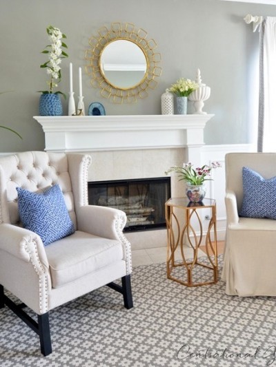
I heart wainscoting. And bold n’ gold starburst mirrors.

Pretty pretty wallpaper. Again, loving the wainscoting.

Icy blue velvet and a gold chandelier. Yum.

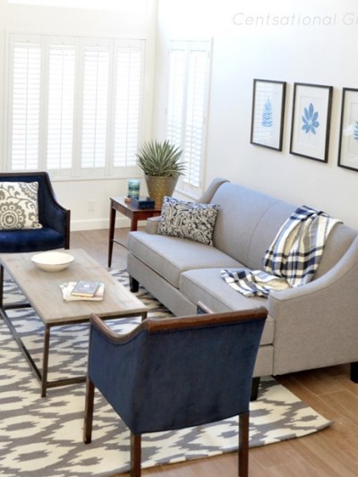
Here’s a bedroom, but in those colors I adore.

Another bedroom, but check out how lovely the cream and gold table looks up against the blue. LOVE.

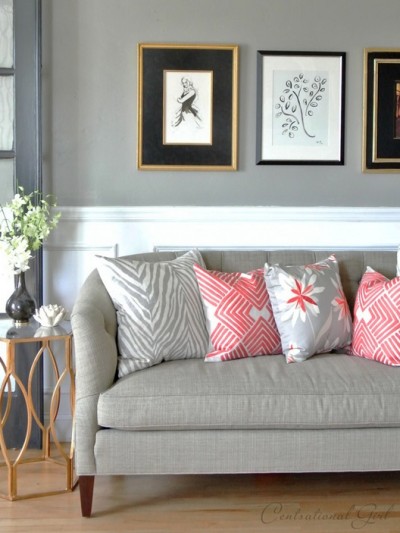
Hmm. A vibrant accent, like deep red? Interesting. Love the chandy.

Another fabulous color combination.

Here’s an example I like of mixing traditional with modern glamour.

Dining room perfection in my eyes. Love the mix of fabrics and wood tones.

So those are my inspiration photos.
Here’s the space I feel needs some sprucing !
Here’s the living room from last autumn with its warm tones and too traditional decor for my taste. Please forgive the bad lighting. It’s a little cluttered, so it’s time to streamline.


Here’s a few things that will definitely stay: 1) the piano of course ! It’s a family heirloom given to us by our gracious grandmother. 2) The cream rug because I can’t afford another right now (unless you find one for me!). 3) The chocolate velvet settee which fits the wall perfectly. 4) The bronze silk curtains 5) The vintage blue glass lamp in the corner and 6) the little white French style chair I redid last year.
Everything else is pretty much fair game ! I especially don’t like the beige bench under the window. So here’s the plan so far: I’m definitely installing some DIY wainscoting around the room and I’ll be painting above (or perhaps wallpaper?). I think I should slipcover the sofa. I need something completely stunning under the front window. Maybe I should bring the cream cabinet downstairs and put it there? I also need some new or rearranged art. Perhaps some DIY patterned pillows ? A new chandy splurge ?
What do you think ? Are you digging the blue and gold medley I’ve chosen? Know of any reasonably priced décor or fabric that this space is screaming for ? Got some ideas or links to fab décor ? Bring it darlin’ ! Help a girl out.
I would love to hear what you think !

wow, yes, the blue and gold combo just feels so rich and classic.
i will admit, though, i’m not particularly fond of red as an accent color with the blue/gold. i would stick with warm colors for accents. and girlfriend, i hear ya on that turquoise lamp! that’s a beauty! as far as particular fabric or decor to recommend, not much help…. just wanted to say you’re headed in a GREAT direction!
How about your patina dresser? Maybe it’s the wrong shape/size. Hmmm. I think the cream cabinet would be lovely and play off the mirror, chair and fireplace. I like the blue/golds idea.
You could just about get away with just paint and cushion changes in your favorite blue (remember blue gets bluer on walls). Gold/orange accessories.
Wainscoting is ridiculously easy (for someone of your talents ahem). Why not go for it?
The daybed looks awkward, but the chocolate settee is lovely! The window treatment is a little beige though, as is the chair seat – maybe different blinds? A trim?
I feel so rude commenting on your room! I do think beige muddies the waters though, if you want a modern twist.
Your pieces are such classics that I’m sure once you change some wall colors and accent pieces, you’ll begin to love again! The good news is that your large objects in the room are neutrals, so I’m sure that the blue and gold touches will brighten things up and give everything a new feel! Having said that, I really like the pieces you have. You have traditional elements, but they certainly aren’t old and dowdy feeling! If I could update one item, it would probably be the triptych mirror over the settee. If you did another large piece with perhaps a lacquered finish, it might be a little more like the Style at Home inspiration pic…traditional and modern decor living together as one in harmony. Ha! ; )
LOVE the colors you’ve chosen! Add the wainscoating, paint or paper the walls in a wonderful blue, change out the frames and/or mats on your artwork, get some new pillows (or recover them) and you’re off to a great start!
thibautwallpaper.jpg makes me SO happy. I love everything about that picture.
Take a look at what has just posted on theLENNOX, you might bring out more cream and gold.
Karena
Art by Karena
I can totally see where you are going with your living room. First off, when you lighten up the room, your piano is going to look fabulous! Next, I would say that the lovely brown settee would look great slipcovered in a light fabric, with pillows in whatever blue you choose. Also, the great little french chair with the animal print pillow could have a similar color blue pillow with an interesting pattern on the fabric. I can totally see a fabulous sunburst mirror replacing the three piece mirror. Add a light lampshade to your existing lamp to save $$ and lighten up the accessories. I love your idea of blue & gold medley & the wainscoting and light paint above it. Can’t wait to see how it all turns out.
Hi Kate-
It is refreshing to see that you like gold accents – they are classic, but it seems like so many shun gold for the more trendy silver or burnished bronze.
You have great ideas and style, I am looking forward to following the transformation.
Oh, I just love the idea of slipcovering the sofa, brilliant Pam ! Love your ideas ! Yes, Steph, that pic is fabulous ! Keep these ideas coming, I’m loving this !
in the words of Dora the Explorer “yum yum, yum, delicioso” LOVE that color scheme. and that one picture with the floor standing white mirror-oh my word-pick me up off da floor! love it!
Well as for ideas-girl you asking me for ideas is like somone asking a blind man if he can drive a car. You my dear have that “it” factor when it comes to decorating and Im sure you will knock it out of the park like you always do! All I can say is pops of color, texture and some new lighting and you’ve got yourself a new room!
I can very easily see your inspiration images taking shape in this room, with many of the items that are already in place. It just fits…can’t wait to see the transformation! Janell
I love the colour! that’s actually the colour I’m painting my masterbedroom in!!!(Benjamine Moore Robin’s Nest 618 part of Pottery Barn’s selected summer colours =D) I have been wondering what to do with the walls above the wainscoting in my house and you have just given me the inspiration!!
THANK YOU SO MUCH! and I LOVE this colour with gold, white and brown! Cant’ wait to see your room transformation!
i adore the color palette and you have so much to work with!! here is my two cents:
i would use the first picture for some literal inspiration. If possible, reupholster the chocolate settee in the moss green and do the gallery prints above it. I would move the mirrors to above the fireplace. Maybe put a blue fabric on the white chair. the bench has to go, maybe a console table or another piece of furniture in that pretty pearl white paint you have. change the brown lampshade to white, too. you also have to find a sunburst mirror – it was in so many of your pics!
and finally, something really splashy and fun – gold leaf the mantel and wood surround of the fireplace.
I laughed to myself when I saw the photo of the piano. I just “borrowed” my sister’s baby grand so that my son could play it until he leaves for college in September. It has sucked up all the spare space in our living room – I can’t even try to make it look good in our space, but as long as Chris enjoys it I can handle the visual chaos until he leaves. I think yours looks great – a perfect fit. I do think, however, that the recessed rectangular area of your fireplace surround (below the mantle) is screaming for some sort of detail – perhaps an elongated diamond or other wood finery. I look forward to seeing what you do to your space. Where do you find the time??
Hey there CG:
House Beautiful recently did their mag based on the color blue–so many of the rooms were done in the shade you aspire! Maybe taking a peek might help?
But, knowing you, you’ve already checked that out!
You’re a shade off Tiffany and that can’t be BAD at all! :0)
I’d paint the walls blue, then the 3 piece mirror would get a little gold rub ‘n buff to give it some highlights. A fabulous sunburst mirror over the fireplace with wonderful gold sconces and some greenery in a beautiful cache pot. I’d add a fabulous mix of blue and gold print fabrics for the settee and redo the chair in a wonderful blue and gold silk, something really dreamy. Cream for a lot of the accessories with some gold touches. Maybe a small coffee table with a glass top and dark legs with a tiny bit of gold . I think the drapes will work perfectly and will really stand out once the wall color is changed. Great room. I can hardly wait to see what you do. Hugs, Marty
….from a totally “do not know how to decorate” blogger……I just love your room like it is!!!!!!!!!!
DON”T CHANGE ANYTHING!!!
Don’t go the wallpaper route. Although it is trendy right now, it was also trendy back in the late 80’s and early 90’s. I wallpapered alot & grew tired of it quickly. It is a real pain to remove!!!
Didn’t know if you would slipcover or have the settee reupholstered- you could have those cute little legs done w/ a gold leaf and then a gorgeous fabric- although a slipcover would be safer and more affordable.
I actually think that the daybed is one piece that could possibly work in the “new” room as-is due to its color.
As far as fabrics- I can’t tell on my screen if the blue one of these is too periwinkle, but they have tons of stuff w/ free samples and great pricing-
http://newtoto.stores.yahoo.net/tin6coriemsi.html
LOVING the gold and turq…the contrasts are soooo invigorating–esp the RED in that one bedroom, I’m dying! I love your big, dark piano, its such a gorgeous, bold, rich focal point……I LOVE the colors, go for it, girl. If you must wallpaper, maybe try it on one wall, or inside moldings on a wall thats wainscotted and molding-ed(ack! I think I just made up a word!) can’t wait to see the final result…all your stuff is just amazing!
I’m trying to get back into blogging today but I don’t think I’m functioning well enough for suggestions as of yet. I do love the blue…ice/aqua/sea glass…anything in that family is my fav. I tend to shy from gold, but of course I hated silver things in my house until I started blogging. Now, I am always on the lookout for trays and candlesticks. What I like is what I like at the moment…if it makes you feel good, go with it!
umm… i love your current living room, but that’s possibly because it’s just classier than mine is – possibly because my living room/scrapbooking area/dining room/kitchen is all one space. i’d totally take that bench off your hands, though… ;)
i really, really love the colour combo you want to use for the makeover though, and may possibly steal… umm… i mean, copy… it at some stage in the future…
anna (first time comenter – a scrapbooker who is spending waaay too much time reading home decor blogs…)
I love the blue with the gold! I think you should totally do the boxed wainscotting. I blogged about it today and have some examples. You might like the one that I featured from House of Smiths, where she applied vinyl inside the boxes. You could also paint the blue color inside the boxes.
I can’t wait to see what you come up with! Good luck.
Honey…YOU have the eye on the prize! You know distinctly which direction you are going. Go…Do…This is what you do well!
Your gorgeous piano is the cats pajamas! Do you play?
Love it! And I know you will come up with something spectacular that will dazzle us all. Can’t wait to see the result.
Ok – so I am loving the “bones” of the room! I think – and this is purely my personal opinion – that if you keep the “expensive stuff” neutral you can modify it to suit your color loving needs. Personally – I love the blue and gold theme you are dreaming of doing! But you gotta put that lil bit of red in it! That is fantastic!!
Hey Kate! Love these living rooms….gorgeous choices! Just wanted to tell you that i mentioned you in my latest blog post…you were the motivation for me to complete my upholstered headboard. Go check it out and tell me what you think!!! :)
Kate; I think the first pic is your inspiration… (it’s your fave, cause you put it first)… so here goes from someone who thinks you’re the best after that FAB Kitchen which I still dream about;
1- the walls are that wonderful blue… and do the wainscoting -then either wallpaper a fab damask design inside picture frame molding or do stencils ( THibaut is my personal choice for wallpaper, and I’m doing a gorgeous blue design in my MBath from Tone on Tone resource book#56400, pattern T7795…) Wallpaper can be timeless if you stick with the classics!
2… Either of those starbursts mirrors are wonderful…. definitely over the fireplace..{ I’ve been craving one for 2 years now, and I will find it, and at a price i can manage!)
3 the moss green velvet would tie back in to the dining room / kitchen scheme, and you are also going to bring in more Heirloom ” white against that blue… with your magic touch, it will be drop dead wonderful
4 Please do a nice botanical grouping as large as this one and it will balance the piano and window opposite…
it’s your call on the drapes and furniture…. sometimes after the paint, the room just begins to “tell’ you what to do…. and you, girl , know just how to listen…
can’t wait!
Bon Chance!.
PS. Just gotta share that I’m painting a heavy gilt gold mirror in your Folk Art metallic taupe to put in the powder room which I am upholstering in a $3.49 brown and cream toile from the calico shelf at Hobby Lobby !It’s gonna be awesome….
Wainscoting alone will make a huge difference. Very classy! I love that. I think you may be surprised and possibly change your mind once you do that as to what you want to do next. The blue is always pretty too. I’d do a very pale blue above the wainscoting and skip the wall paper. Go for texture too. That always makes a room feel really comfortable and (I feel) makes a room more interesting. Slipcovering the sofa wasn’t a bad idea either – if you’re up for that… and I think you are. ;) Good luck!
Oh… and look at this link for some inspiration… I think you will like what they did and they have a little light blue sofa similar to your brown one… but this looks to be right up your alley…
http://www.phillymag.com/home_garden/display/Excellent_Vintage_0410/
I love your inspiration photos. I think, however, that this is a ubiquitous color scheme for our time (like peach, turquoise and mauve in the ’80s) so I personally would not invest big bucks in major pieces in this scheme. (Reading your blog tells me you won’t, either!)
That said, I was in a room (designed by a stylist for Williams Sonoma) in the color scheme you are smitten with. It photographed very well but it was REALLY BORING to be in the space. I have thought a lot about why it was so tedious and my conclusion is that it was too “matchy” and too bichromatic (as opposed to monochromatic). Long way of saying, I think you’d be happiest living with a room that had a punch of some unexpected color – like your inspiration photo with the red. (Although personally, I’d tend toward coral or a more orangey shade just for a tiny spark of relief from the blue/white/black(piano)/gold – or even a darker shade of your blue just for some relief.)
How to accomplish this??? Well, I would start by finding a fabulous fabric with your key colors (blue/gold) and an accent color (like the red in your inspiration). I don’t know fabric stores in Petaluma, but when I lived in Granite Bay I LOVED this store in Roseville: http://www.triadplusfabrics.com GREAT prices and killer sales. If you are headed to Tahoe some time, stop in and check it out. You could use whatever fabulous fabric you find for DIY pillows or I’ve also seen cost-effective use of a fabulous fabric on just the back of a chair (like your French style chair). Add punches of the accent color around the room just to spice it up.
What to do in the short run? You are so good with spray paint that you could (in a pinch and for a quick change) spray paint your mirror frames, candle sticks, etc. Also, in looking at your photo, I’d suggest you try switching the table to the left of the FP with the little chest on the right. Your lamp would be higher and there would be more to balance the bulk of the piano (and add more substance to what appears to be kind of an empty corner). There may be a reason that my idea won’t really work in your space, in which case you know best! As for the beige bench… if you hate it why not try surgery on it? How about hacking off the arms and repurposing it as an upholstered cocktail table with a tray or something pretty on it??
I know this is a long comment, but you’ve given your readers (or at least this one) soooo much to think about!!
Go for it! Paint that room the shade of blue you are thinking of (blue/green) and then get a new lamp in turquiose and some pillows to tie it all together. Find a few gold accents – since you included the gold in so many of those beautiful photos. Painting the walls will be the “key.”
-Trish
Yes I love that color combo. You need our help…PUHLEASE! You my girl…ARE UH-MAZING and will probably pull something out of your rear tomorrow that stuns us all…I just know it.
Botanical grouping over the sofa maybe and mirror over the fireplace… (?)
LOVE the last two inspirational photos!! So calming, so beautiful. But I must say, I adore your room the way it is — so I can’t wait to see what you come up with next!!
Oh.Em.Gee. My mom has the sunburst mirror fromt he 3rd pic & bought it off of craigslist for $10!! I saw another recently in the nashville craigslist too. Def. check your local craigs for these mirrors! The framed botanicals, brass frame and all against the turquoise will be so lovely. I know any color you combo with it will be heavenly! (yellow is my choice combo right now) :o) Also can’t wait to see your little boy’s room!!! I’m sure you heard that already though.
Love the blue…so comforting!! I don’t suppose you would want to sell that Eiffel Tower piece????? I love it!!
I love your inspiration photos – I think you just gave me some inspiration for one of our guest beds! I have some old furniture that was my mom’s growing up, and then it was mine – it’s this nice ivory with gray – blue and gold detailing. Now I need to get on the hunt for a few extra items to finish the room – thanks for the ideas! And of course, I think you should totally go for it with your living room! It will look beautiful.
Go ahead and paint it in your inspiration color and the rest will fall in place. Paint is the cheapest part. In a few years you can change it! Love the neutrals with the paint color. Especially like the Southern Living inspiration picture. Never thought of red with this. Just keep it in small doses.
I agree…slap a nice blue-green paint on those walls! I LOVE the color of the wallpaper in the Thibaut picture and I think that color would look fantastic with your “keep” items.
And who cares if this color combo is common? Your furniture pieces are going to look great with a great range of colors, so going with blue now doesn’t mean you can’t go with peach next (if that really does take hold). You have beautiful pieces…they are going to look great in a blue room!
In addition to new colors and patterns, repositioning some of the furniture will also give your room a new feel; how about:
1) the beige bench that you don’t like under the window is a perfect “linking device” to position in the middle of the room because it doesn’t have a back, therefore, it can be used to sit upon and face either direction, and when not being used to sit upon, it doesn’t block any view. I suggest placing it in approx. the same position as your settee, except coming off the right side of the fireplace. So the chair you recovered ….
2) could now be moved to face the fireplace and positioned closer to the settee on the wall, but slightly on a diagonal looking towards your “window corner” and the view. The chair situated there suggests a conversational grouping between the chair, settee, and bench; it could also be listening area for your piano concerts. I’d further anchor this core seating area with …
3) a chandy or really large drum pendant centered over the rug. I know you want a crystal chandy but if you really want to interject a more modern feel, the large drum pendant takes the room in that direction; a crystal chandy with the grand piano may be too expected / traditional. Also, the drum pendant could be covered in a pattern or stripes, bringing that extra dimension to another plane of the room. Finally,
4) when I play the piano, I prefer anyone listening to be in front of me, rather than behind, that way I feel I am interacting with them. How about rotating the piano 180 degrees? It could also move a little closer to that side window — now that the bench has been relocated, so that the pianist has natural light and a great view. Also with the piano reoriented this way, the flat surface you use for display is more visible and connected to the room; also, for parties, you could place stools around the piano and use it like a piano bar, or simply as a serving surface for appetizers and beverages.
Your room has so many great things you can do with it; I wish I had these challenges!
what a lovely room. I do think you really need to play up the fireplace! How about a fab mirror up there? &taking down the ones above the choc. sofa? Your new color palette will be fab in here! Thanks for sharing!
Oooohhh…. I would love a chandy! Particularly with that piano – it would really give the room a rich, decadent feel – maybe a very vintage-y one with gold incorporated? To get back to the look in some of your inspirational photos? What about saving that cream bench and recovering it in an aqua hue? Perhaps it just needs a different color and place, in the room?
That piano is divine, by the way!!!!
Erin
YAYDIY.com
Love this color scheme myself, Kate! I actually have it in my master bedroom {just posted about it for a bedroom linky party, if you’d care to see}. I have that color on my wall and mine is Milk Pail by Martha Stewart from Sherwin Williams. I also have a series of botanical {fern} prints over my bed. I think you know that paint will be your best friend in this refresher. I’d do the walls first and then see how what you’ve got looks against the new color. The fabrics in your room already look a lot like those in your inspiration pictures, as far as coloring. Have fun!
Love the inspiration pictures! I’ve painted every mirror frame in my house with layers of golds and bronzes so I’m digging all the gilded inspiration mirrors! I think a little dry brushed gold on the mirror above your settee could transform it! Also love the wainscotting – I’m a huge fan but it just wouldn’t work in my loft home… glad you can use it! Ditto for the chandy.
I love that color combo. I suggest checking out TJ Maxx/Homegoods for the gold starburst, they usually have quite a few different styles. I got mine there!
Bonus – your bronze curtains will look so amazing with the blue walls and gold mirror!
I really love this color scheme and am very slowly in the process of changing the master bedroom to a blue and cream scheme with gold accents. And since I have a raspberry toile chair in there that isn’t going anywhere (because I love it) I’m all for working in shades of red.
I love the look of wallpaper right now but have you ever removed it? NO THANK YOU. It’s not fun. I think you would be better off with just paint. Your room is beautiful, and I love it the way it is but I completely understand the need for change. I can’t wait to see what you do!
If it was my room and I had a thing for gold and turquoise (oh wait– I do. Ahem) I would put a big ornate mirror over the fireplace, get some textured wallpaper on those walls and throw something sparkly in there. Maybe some chrome. Use your office for inspiration! It’s very, very close to your inspiration pictures. One thing I noticed in those pictures that is a recurring pièce de résistance are the windows. They are huge and open and light– like your dining room. Maybe extend the curtain rods out farther so the curtains sit on the walls instead of over the windows, and remove the wood shade?
Thank you for sharing the inspirational pictures and your lovely living room. I plan to make my own botanical prints this summer, they are so beautiful aren’t they? :)
Have just recently come across your blog and am LOVING it!
I think your inspirational pictures are great, and would definitely go with the blue and gold tones in your lounge. You seem to have some of these colours already with the blue glass lamp and bottle. All I would do is add some cushions in different shades of the same blue with gold trim, maybe change the lampshade to a warm gold? How about putting some gold leaf on the 3 framed mirrors above your settee?
Just me personal view, but hopefully some more ideas to add to your list. :-)
The new color scheme is lovely, although I think the Southern Living room with splashes of red is my favorite.
Please may I join the queue to have anything you get rid of? Your idea of ho-hum is probably better than I’ll ever achieve!
I like your inspiration pictures, and I KNOW you’ve got the skills to DIY. I think bringing that pretty blue in will be so nice! It’s going to be fabulous. :)
I’m so glad to see you pairing this beautiful blue with gold! I recently re-painted my powder room with Restoration Hardware’s “Silver Sage” (which I chose through the highly scientific process of wanting the color of the RH bags)–and I chose that color specifically because I wanted to re-use the golden and bronzy accessories I already had. You see this color used a lot with very cool color schemes, but I think it also lends itself quite nicely to a warmer scheme.
How about a wonderful mirror for above the fireplace? Maybe a round one with a very chunky gold frame? I don’t think you’d necessarily have to slipcover your sofa, since brown goes with your blue so beautifully. But some DIY pillows are a great idea, both for the sofa and for your other upholstered pieces. I like what I can see of your bench by the windows–would that be a good candidate for new upholstery?
Of course, whatever you choose will be divinely lovely, and it’ll be so much fun to see what you did and how you did it. :)
Hi Kate: If you scroll upward through your post your living room looks fantastic. It is only when you scroll down after all the bright blue that it looks a bit dreary. But I know the feeling when you are sick of a look, it is time for a change. I love, love, love the blue and gold idea and I think your bronze curtains will work right in. The brown sofa may not need to be covered either. I am in agreement with the suggestion above of a big gold mirror (starburst or something large) over the fireplace and maybe some new artwork in place of the tryptic (sp?) mirrors over the sofa, but they may look significantly different when you repaint the walls in the blue. Wainscotting is also an interesting idea! Whatever you choose, will be magic no doubt as you have a great design sense. Have fun!
For as long as I can remember, my mom has had the same mirror in Pic 3. If not identical – then VERY close. She always asks me what I want when she dies .. morbid I know … and I always say “the mirror!”.
There is a great canvas art for $19.99 at Target right now. I just got it to go in the bedroom (I think- I’m the queen of second guessing and returning at Target!!). They don’t have it on-line, of course, but it’s birch trees with yellow leaves and the blue sky mixed in… kind of abstractly. But, you might like it for the mixture of colors that you’re going for. I’m working it into a gray/yellow decor scheme that I’m coming up with.
Hi again, Kate;
Just loving reading all these fun ideas and suggestions (which all of us who are FANS OF CG know you will blow our socks off whatever you do)….. but it’s so fun to be invited to your Thinking- out- Loud party!
I love Robins idea for moving the beige bench to a new position as a Linking device , and subsequently moving the piano towards the window…. Just a word of caution re; pianos and windows…. especially our grands which we open…… all that light and heat can affect both the finish and the innards which make the “joyful noise” , so note which direction that window faces to avoid some expensive repairs… been there…. done that! Hope those cute young’uns will soon be doing their etudes at that lovely family heirloom!
and oh, giggle…earlier I wote “starburst” mirror,… but we all know i meant sunburst…..
have wonderful weekend!
Some thoughts (to add to the plethora of others):
—Love the wainscoting idea. You may want to consider going higher than chair rail height, if you’re trying to tone down the formal feel of the room. The fireplace surround, piano, and the shape of the furniture will always tilt the room in the formal direction; but going higher with the wainscoting will give the room a more coastal/cottage/casual feel (if that works for you).
—I’m not personally a fan of gold, but I can appreciate how it’s working in the inspiration photos you posted. I’d just urge you to go with a few more colors in the palette. This will give you more flexibility to add modern, casual elements to the room. The pale teal-gold palette seems to lean automatically toward austere.
Here’s three options I picked out from Color Collective:
http://color-collective.blogspot.com/2010/03/jose-villa-via-style-me-pretty-also.html
http://4.bp.blogspot.com/_ljqeBsW6g10/S88dH0tDaTI/AAAAAAAAAbc/CCePKutrMAc/s1600/annakern_01.jpg
http://color-collective.blogspot.com/2010/04/andy-gilmore-via-sojamo-tumble.html
—I’d love to see that white chair painted in the teal or other complimentary color with a bold geometric on the seat.
—And if you go with a traditional white for the wainscoting, I’d love to see a strong color or graphic wallpaper above.
Can I give my 2 cents worth? DON’T DO THE SUNBURST MIRROR. Ugly! I don’t care who says it’s in style, it’s awful. If I walked into a home to redecorate and saw that, the first thing I’d say is that it needs to go. The gold is pretty, just not in a sunburst mirror.
As for your current room, it’s very lovely, and I know you can turn it into something fresh and new as well. I would take down the 3 piece mirror. And I would go for something larger over the fireplace, replacing the 2 pictures.
I love your blog, very inspiring and it makes me feel like freshening up my home all the time. I love your ideas for painting furniture, adding a mirror to the top, etc. You take it to a whole new level.
Keep it coming! And if you’re sold on the sunburst mirror, go for it without looking back because I don’t live in your home and the main thing is that YOU like it!
I do love the cream and blue color combo; not so shot in the head about gold but that’s a personal preference :-) It certainly looks great in the photos you shared! Mmmm, that wallpaper in the one photo is exceptionally GORGEOUS. If not that, then something similar with the wainscoting would be stunning. Definitely some DIY pillows in luscious shades of blue; you can splurge on small pieces of great fabric for those. I never thought I was a chandy person until we moved here and began prowling through the amazing antique shops in Cordoba; I am so hooked now! LOL Unfortunately our rental house has nowhere to hang one. But one of these days…!
Hi Kate!
I discovered your blog a few weeks ago, and am addicted! I check it almost daily to see what new and fantastic things you’ve been up to! I will be moving to a new home soon, and can’t wait to do some decorating – you have totally inspired me! I love the blue you’re thinking about for your living room, and especially love the wallpaper in the one inspiration picture. Here’s an idea I’m thinking of trying myself. I saw an episode of Color Splash on HGTV where they were redoing a master bedroom in a shade of blue similar to what you’re thinking of, and they used a stencil in a pattern similar to the wallpaper. They first tried a different finish of paint in the same color as the wall, then I think they ended up with a lighter shade of the same color. It was really beautiful, and would probably be cheaper (and easier) than putting up wallpaper. If you go on the HGTV website, go to “Colorsplash” and you should be able to find the episode! Good luck – I know whatever you do will be beautiful!
i didn’t read all the comments, but recently I saw a “virtual” room makeover (I think Layla at TLC put it together) where she recommended the “faux” wainscoting treatment on the lower hald of the walls, but then UP the wall above the firplace–making it look like a whole “built-in” thing going on with the mantel and fireplace. it was gorg. i think that would make it an enormous focal-point. if you can’t visualize what I mean, email me, and i’ll try to dig up the image. love the room, even as is, btw.
Hi Kate, I know you need a change but DANG! I’m loving your “before”! Huge fan of icy blue though, and it would look fab with your velvet brown sofa and a bit of red for accent. That’s the scheme of our master bedroom and we’re still in love with it after 4 years. The colors are really easy on eyes and I have yet to grow weary of it. Can’t wait to see your diamonds on a dime remodel!
I would start with paint. Loving RH Silver Sage that another reader recommended. New pillows and seat fabric on the white chair. Would you consider banding the drapes in an accent color? That triple mirror needs to go (very fussy) I would go with something uber contemporary perhaps with a brushed aluminum or silver frame. Check out the great fabric at Discount fabrics USA on the web. They have swatching service and great prices! Can’t wait to see the after photos.
I’m in the process of re-doing my loving room right now in the blue’s, creams, and golds. Pretty much every piece of black furniture that was standing still in my living room has gotten a coat of heirloom white, gold, or mirror finish, lol. Ben Moore has a great color called “wythe blue” which is what I chose for my walls…very chic and would look fab with your curtains and/or w.c.. Check out decorpad and search Miley cirus’ crash pad. It has a great inspiration photo which (if you like it) combines your taste for the blues/turquoise and your existing choc brown accents. Can’t wait to see the “afters!”
I adore the robins egg blue or aqua shades….but Kate…your so ingenious anyway; why not throw a newer choice of a bold accent of your own fixing. Perhaps a rusty/burnt orange, or a rich earthy red to go with….something all about you. Throw fabric scrapes about or paint chips and play. Put the mags away.
I absolutely love blues and especially turquoise… I saw this wallpaper http://www.lauraashley.com/Duck-Egg+Blues/TATTON-WALLPAPER/invt/3439792) in the UK in a store last year and brought home 4 rolls of it. It is a gorgeous goldy cream with light teal… I am not sure if you can get it in the US, but it really fits the color scheme you are talking about!
Love your blog btw! :)
I’ve been “visiting” these frames for a while for my own living room. I think they would look great in your scheme!
http://www.potterybarn.com/products/pb-gilt-frames/?pkey=x%7C4%7C1%7C%7C10%7Cframe%7C%7C0&cm_src=SCH
I CANNOT wait to see what you do in here! I am having the same problem with my living room. It’s to traditional and warm. I have the exact same curtains and a similar rug. My walls are even probably the same color. I’ve been begging my hubby to help me with wainscotting and changing the wall color. I’ve already added a sunburst mirror and antique gold frames. Can’t wait!!
I am also drawn to your color choices; although I have never liked gold except in jewels- reminds me too much of brass. You’ve got some great pieces to work with. Sometimes we just need a fresh eye on the space & I think that is what you are asking for. First I would suggest you hang the 3 piece mirror set above the fireplace. Flank both sides of the fireplace with same or similar items: table, small chest, large vase with branches or large potted plants. You might have these items somewhere else in your home. The chocolate sofa could face the fireplace, have a throw & pillows in the beatiful blues you have chosen. I would keep the bench you refer to under the window; but rather move it to the wall your couch is on now. Then hang your collection of botanicals above it. Another placement for your bench could be in front of your fireplace – cozy in winter, and during the summer months it could work like a coffee table with stacks of books/mags and large tray for refreshments. Your piano may have to be rearranged to allow this. It’s hard to tell what your working with on the other side of the picture – a wall , doorway, stairs? I’m sure it’s going to be ‘Centsational Girl’. Can’t wait to see the after. :)
I am finding your ability to get soooo much done slightly more impressive than your gorgeous projects. Wow you do a lot. And all of it great.
Each person here has given some wonderful ideas but I am keen to see what yours were. Whatever your result is it will be superb.
Whenever someone asks me what my ideas are on a particular room I always say the same thing – de-clutter. Because can’t we all be accused at some stage of cluttering up a space? De-clutter, de-clutter, de-clutter lol
Bring on your after-shots – can’t wait. Bet there won’t be any clutter at all.