Centsational Style
Toggle nav
About
Projects
Style Files
Travel
Art Company
Contact
Category:
Decorating
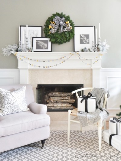
Holiday Mantel + Lynch Creek Farm Collection
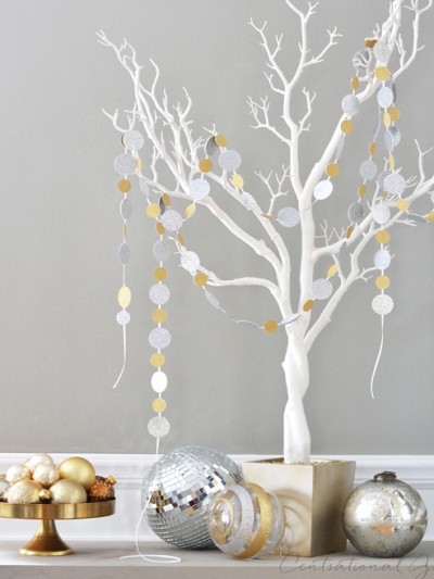
Sparkle Confetti Garlands
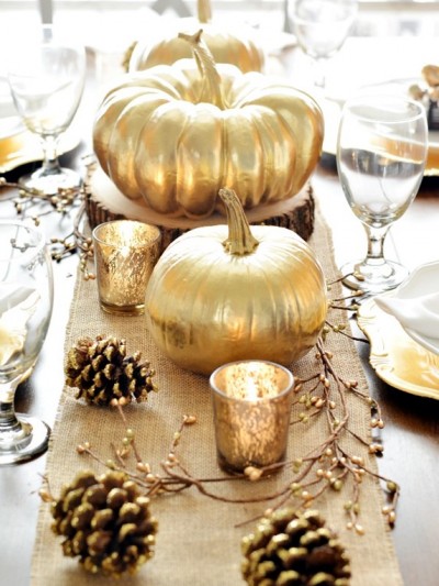
Holiday Tabletop Favorites
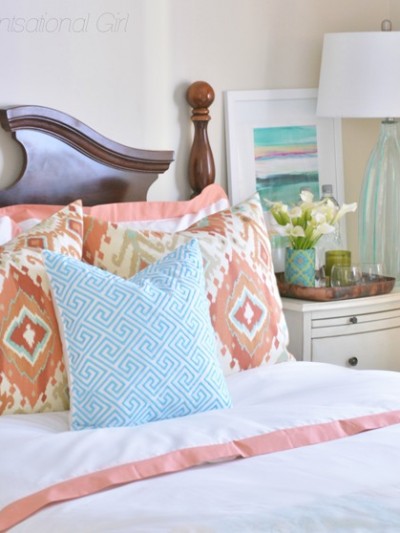
A Welcoming Guest Room
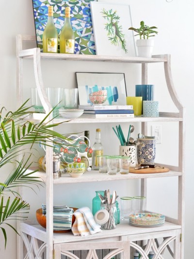
The Prettiest Baker’s Rack
Decorative Rattan Roundup
Our New Teal Blue Sectional
Mixing it Up with Melamine
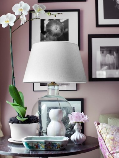
Rethinking Pastels
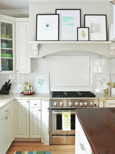
Art in the Kitchen
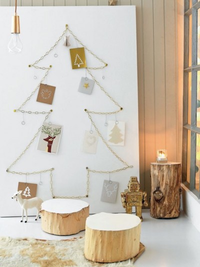
Favorite Christmas Card Displays
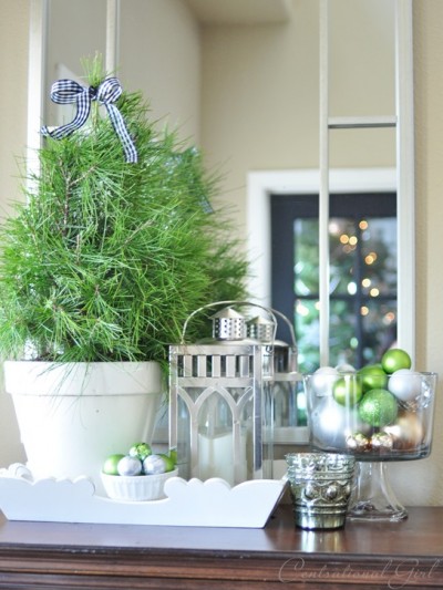
Our Home This Christmas
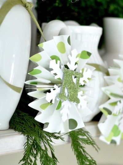
Paper Medallion Holiday Banner
O Christmas Tree + Capturing Bokeh
Pages:
1
«
...
2
3
4
5
6
...
»
26