Centsational Style
Toggle nav
About
Projects
Style Files
Travel
Art Company
Contact
Category:
Decorating
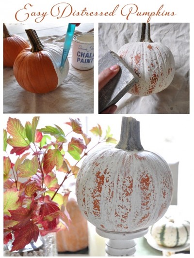
Three Easy Fall Crafts + Link Party
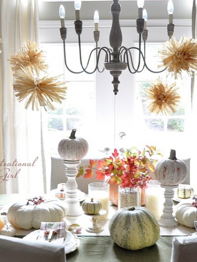
Autumn in the Dining Room
A Fall Wreath Story
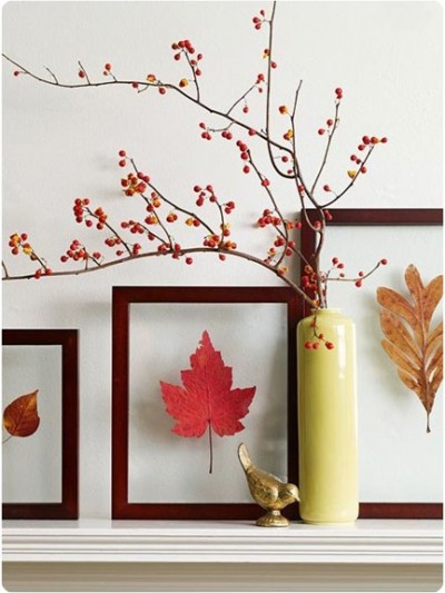
Autumn Accents
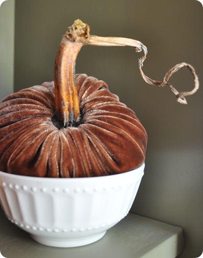
Plush Pumpkins Giveaway
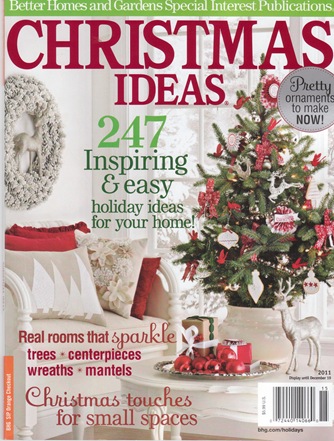
Behind the Scenes with BH&G
Transitioning Your Home For Fall
Wondering About the Walls
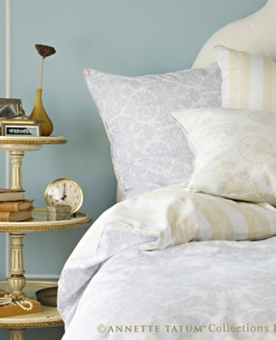
Secrets of a Well Dressed Bed
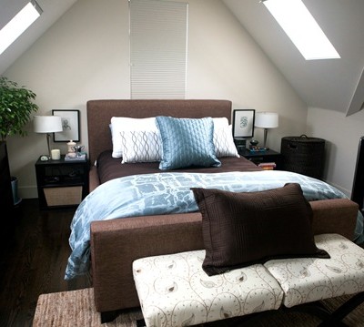
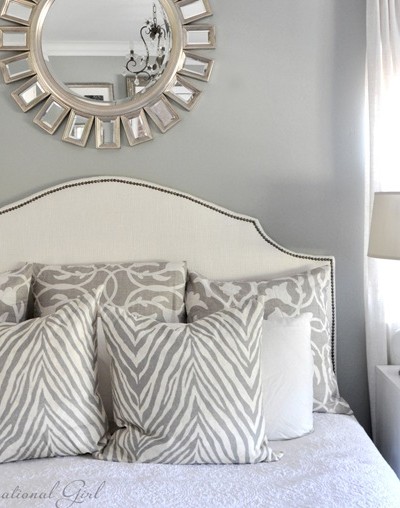
Master Bedroom Update
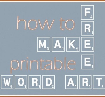
Make Your Own Printable Word Art
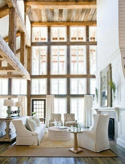
The New Rustic
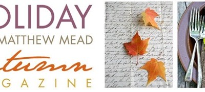
Get Ready for AUTUMN + Giveaway
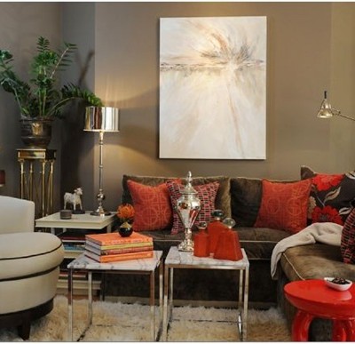
Masculine Design: Beyond the Man Cave
Pages:
1
«
...
12
13
14
15
16
...
»
26