Centsational Style
Toggle nav
About
Projects
Style Files
Travel
Art Company
Contact
Category:
Ask Kate
Hiring a Professional Painter + Winners
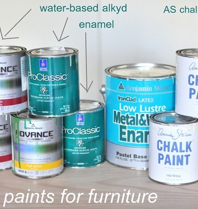
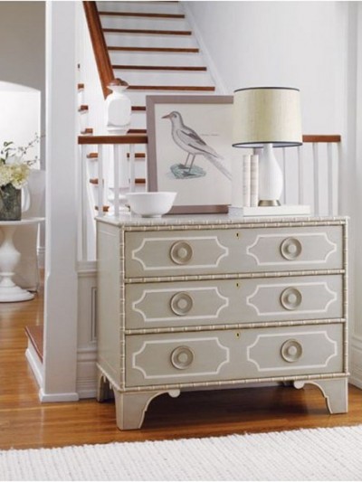
A Blue Bureau + My Favorite Paints for Furniture
A Typical Day in My Life
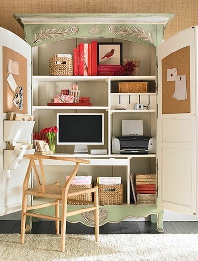
Small Space Solutions: Home Offices
Choosing Paint Colors for Walls (the Easy Way)
Ready to Paint, But What Color?
50 Things to Write About When You Have Writer’s Block
8 Essentials for Painting Furniture
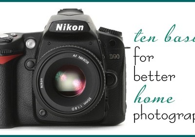
Ten Basics for Better Home Photography
8 Gift Ideas for the Host or Hostess
Why I DIY
Weekend Fun + Q & A
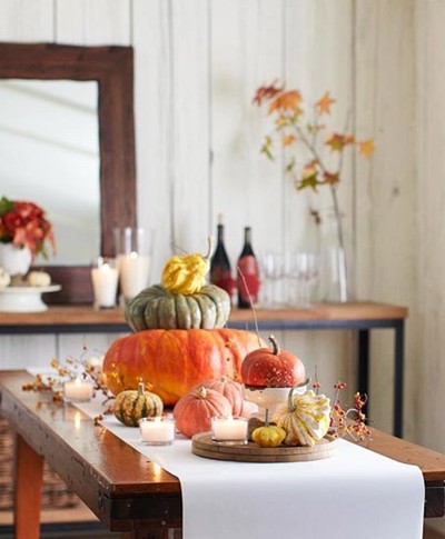
Centerpieces & Meal Service
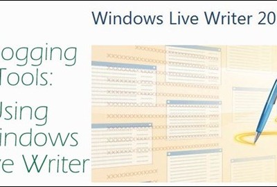
Why I Use Windows Live Writer
Pages:
«
1
2
3
4
5
...
»
6