Design trends… we love to call them out, cheer them on, and even criticize them. I started a series a few years ago inviting different bloggers and designers to weigh in on what they thought about the design trends for that year and it’s always a great conversation. This year there are four new voices: Maria Killam, Canadian blogger and colour expert and the voice behind Colour Me Happy. Courtney Lake, an interior designer in the San Francisco Bay Area and long time friend, you’ll find his design work at Monogram Decor.
Sarah Dorsey’s DIY projects and design eye always impress, Sarah is here to share her thoughts on design trends; Melissa from The Inspired Room was voted the favorite decorating blog by Better Homes & Gardens readers, she’s here to contribute her insight as well. These bloggers all have a great eye for mixing color, pattern, and know good design and I’m delighted they are here to dish! I’ll be adding my two cents as always, here we go with the annual Design Trends discussion …

1) What was your favorite interior design trend of 2014?
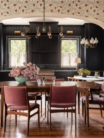
Maria: Indigo blues and navy. It’s been a long time since we’ve seen indigo hues, so it felt new and rich. It’s also a crisp backdrop for bright colours along with black, white and grey. Gold hardware and lighting has been on it’s way back for a while but this year we saw it warming up white kitchens and bathrooms and I fell in love with it. Trendy hardware and lighting is still easier to switch out then bad tile.
Courtney: My favorite design trend was a return to clean design. Many of the designs I admired most were about clean and simple lines — little adornment and having a fantastic statement piece. It was refreshing after years of abundance to pair back.
Sarah: I’ve been loving abstracted beach landscape art – taken from a distance, so people and objects become patterns and create an overall composition. DIY versions are also popping up (makes me miss living at the beach even more!) For furniture, I’m loving, natural mid-toned wood!
Melissa: These are design elements that have been up and coming for a few years, but I loved seeing more people incorporate navy, natural warm woods, and mixed metals in decor. I’ve also been pleasantly surprised with how many of my classic pieces that I’ve collected over time feel trendy now, like blue and white dishes and jars as well as antique brass and copper.
Kate: Black and white stripes and/or spots with touches of gold. It’s unfair to label the combo as trendy, they’re classics, but they were everywhere this year so they seemed trendy but the combination always feel fresh and fun on clothing, textiles, and paper products. Think Cruella De Vil meets Kate Spade!

2) What was your least favorite design trend of 2014?
Maria: Radiant Orchid. I did not understand why this colour was chosen as Pantone’s colour of the year. I did see lots of purple at High Point in the Spring but it did not show up in mainstream home decor. Oh and animal heads. I guess I’m a vegetarian so that would be why, but I just don’t understand the beauty of having an animal skull on the wall no matter what metal it was dipped in.
Courtney: I am not a fan of the overuse of sconces. They popped up in places that didn’t make sense or really had impact. A sconce is functional or ambient lighting option so seeing a sconce being substituted for a dining table chandelier just struck me as that family was going to be eating a lot of of dinners in the dark.
Sarah: Dip dyed furniture has been around for a few years. If not done right, it can look very homemade!
Melissa: My least favorite rooms are ones that seem to incorporate all the current design trends together in one space, without mixing in anything unique to make it more personal or timeless. I guess my least favorite trend is to be too trendy.
Kate: Fringe wall hangings. I liked some of the reinvented macramé and colorful woven rope plant hanger projects, but I am not a fan of the fringe hangings as wall decor, they feel too 1970s for me.

3) What design trends from 2014 will carry into 2015?
Maria: The look of FRESH. Every client or reader I consult with or talk to is looking not just to freshen up their interior, which would seem obvious, but they are specifically interested in light, pale, barely there greige and white shades along with introducing brighter colours into their decorating. There will always be a place for dramatic colours like navy blue or charcoal dining rooms but rich earth tones from the Tuscan Brown trend are being covered up with light.
Courtney: I think you will continue to see an emphasis on fiber art and textiles (knits & yarn in particular). I think that many of the young artists are exploring the 70s and finding a way to bring in the best of the era without making it hokey.
Sarah: Mixing metals and bolder color/pattern combos have both really picked up in 2014 and I think it will definitely carry into 2015.
Melissa: I hope the trend of incorporating a mix of antiques with modern pieces, colors, and fresh patterns will continue and we’ll see even more unique combinations. I love rooms that are one of a kind and tell a unique story. I don’t think you can go wrong mixing old and new.
Kate: Painterly textiles and watercolor art. Brushstrokes as a design accent were big, they popped up on designer lamps, bedding, and furniture. I loved all the DIY abstract art projects from around the blogosphere, the painterly trend will definitely continue next year as we all continue to tap into our artistic creativity.

via home adore
4) Are there any design trends from the past that you would like to see make a comeback?
Maria: No. I think past design trends that come back exactly the same are classics like iconic pieces in mid-century design. Most trends when they come back never look the same as they did in the past. Like gold hardware, you can’t keep your 80’s door knobs, even though gold is back because now it has a patina. The new trend always has a new look to it or an old colour comes back combined with a new colour which makes it seem fresh again. I can’t think of anything old that I would like to see in it’s original incarnation that isn’t already happening like vintage and distressed home decor.
Courtney: I am actually in love with the clamshell shape – yes the 80s clamshell. Well the technical term is channel tufting but it is such a great technique and bring such a unique style of upholstered pieces. I love seeing channel tufting on beds and sofas — it brings a soft rectilinear quality to upholstery.
Sarah: I’d love to see more detailed molding on ceilings like in the Victorian era make a comeback. Paired with clean, modern lines to make it fresh and current.
Melissa: I recently added some deep (almost hunter!) green to my décor and have been mixing in some darker woods with my rustic and painted pieces, so I feel like I’m craving a little bit more classic traditional style but with a twist.
Kate: A toned down version of Miami Vice color combinations, think aqua and peach, apricot and mint for spring fashion and home accessories. Muted nectar, blush, and sea green hues paired with a lot of white and a little gold are so lovely.

5) Do you have any predictions on design trends, hot colors, or fresh looks for next year?
Maria: Gold hardware and combining metals will still be strong. Black is the next trending colour for tile so it will end up on everything else as well. Be careful when incorporating black into your fixed design elements, it feels heavy really fast if overused.
Courtney: I think navy is on the cusp of blowing up. I have used navy in my designs and it has always been a touch under appreciated but it is lovely with almost every one of the trends out there from wallpaper to brass to bright colors.
Sarah: Painterly brush strokes on the walls and textiles. Coral has been popular for a while, but I think it will be everywhere in 2015.
Melissa: I don’t think about future trends much, but I think gray will still be a favorite neutral. I think people will combine it with warmer colors, woods and textures to keep it fresh and give it a richer look. I feel like there will be a little more drama in décor, like dark navy or black walls, and bolder choices with fabric mixing. I think some people will get into a little bit more moody or elegant looks.
Kate: Multicolored geometric motifs are still hot, I’d welcome a Navajo rug trend and more desert nomad inspired textiles with a southwest vibe paired with fresh white walls and wood for texture and warmth.

6) What is a design element you love and consider to be timeless?
Maria: Hex tile for bathroom floors. This year I came to the conclusion that the most timeless flooring in a traditional bathroom is a small scale one. And it should be white or cream. Larger tiles have patterns and colours which date quickly no matter what they look like.
Courtney: I never get tired of grasscloth. It is a consistent in many of my designs and it has a timeless appeal.
Sarah: Incorporating nature into interiors, using fresh flowers or greenery can really make a space.
Melissa: There are so many pieces or elements I’ve been collecting for years that seem trendy right now, but really they are just classic elements that people have returned to. Mixed metals like antique brass and copper, and blue and white ginger jars are great examples of timeless and classic décor.
Kate: Marble in bathrooms and kitchens. The real stuff is pricey but classic, beautiful, and a worthy investment in the right place. I also appreciate the more affordable countertop options like laminate to get the look of marble with engineered surfaces.

I forgot to post the series last year (oops!) but if you’re interested in a flashback with different bloggers and designers weighing in, check out these posts from the past: Design Trends of 2012 and Design Trends of 2011. Thank you so much Maria, Courtney, Sarah, and Melissa for contributing to this year’s conversation!
What about you? Do you have a burning answer to any of the questions above? What’s your favorite or least favorite decorating trend from 2014?
…

Please let this be the end of the bold, high-contrast chevron phase. In most applications, it just makes me dizzy! Sorry to those who love it…
Form and function is always appreciated. For instance, pretty bathrooms with pedestal sinks, where do we put our stuff? Storage is appreciated and necessary.
Yes gold No fringe wall hangings. Got it.
xoxo, Laura
http://www.theaccidentalmama.com
Glad to see mixed wood finishes rather than an excess of dark/cherry — and I like all the raw wood, or raw wood finished with liming or just wax. So agree about the macrame! That should have stayed dead, along with ’80s electric cobalt.
Love your blog, Kate. Hoping you had a lovely Thanksgiving and are looking forward to a well-deserved holiday rest!
Interesting comments about trends…I tend to not follow the “trend” in design…every client is different and has a different perspective of what they want to live with and I will guide them to what feels the best for them in a beautiful way. I will get inspired by a pattern or a piece of art and play off that for the design, especially if it moves me. That way, I’m living or designing around an emotion which makes me and my clients happy.
OMG I love the creative way you wrote this Kate!! Your blog is the best, most fabulous on-line design magazine.
I’m honoured to be included in this years line-up!
xoxo
Maria
Thanks so much for having me Kate!! xo
I agree that navy is hot hot hot right now! Great post Kate!
This was a very interesting assessment from a consumer/client point of view. At times I have wondered why designers I have worked with would push or pull away from certain trends. This gave me some insight into their rationale.
A trend I am becoming weary of is gray. Every room I see , 50 shades of gray. However, none of your designers mentioned this so what do I know? I know I really enjoy your blog. Thank you.
I loved this round up! I’m completely on board with the navy trend, although it’s been my favorite color for forever, so it’s nice to see so many options available in the marketplace now. I love Maria, been following her for a few years now. Her advice is always on target. I’ve used many of her recommendations in our house, and they are perfect.
I so enjoy this series, glad to see it again! I do love the gold, and I’m with Maria that I could not connect with the Radiant Orchid pantone color at all. Great read, love seeing all of these designers’ perspectives.
The one trend I really don’t like is the watercolor art. It is ugly and reminds me of early 90s dental office wall art. I generally agree with Kate on most styles, but again… I am not a fan of the peaches and mint greens. It was my house in the 80s and 90s growing up. I still remember we had seafoam green carpet and my mom had peach balloon looking curtains. Horrendous but apparently stylish at the time.
I do love the southwest look lately with Navajo rugs. I also love anything with gold and brass, hexagon tiles, subway tile and seagrass.
I love the subject of this post and the interesting perspectives from different designers. I try very hard not to be swayed by trends and only buy things I like, that speak to me, and that reflect my personality. I HATE the idea of a dated room. I think the best way to avoid that is to develop the space over time; collect pieces from different time periods, countries, and shops; and always have at least one beautiful antique in every room. I agree with Maria’s opinion on radiant orchid; I thought that was such a bizarre choice. The Pantone Color of the Year is a fun tradition but it doesn’t influence my design choices whatsoever. I will say one of my favorite “trends” of late is the antique over-dyed Turkish rugs… so beautiful, exotic, and timeless.
Thanks for having me, Kate! Such a fun post!
I agree that the navy trend is continuing to be hot. And not just because I did my powder room in navy lol. I’m also glad that I’m not the only one that didn’t like the whole radiant orchid thing. Great article!
Such a fun post to read today! I have to agree with, Maria, about you being the best!:-). I love the trend I’ve seen this year of designing with a neutral background and adding in pops of color. I love the use of gold accents. And I love the mixture of metals and wood tones in the same space. It will be fun to see what 2015 brings in design arena.:-)
Hi Kate!
I totally agree about the marble in bathrooms and kitchens. It is timeless, and when you are dropping such a chunk of change on something that you won’t be able to update often, it makes sense to ‘invest’ in something you will love for ever! Like me and my white cabinets! I have had them always as a home owner and I think I will ALWAYS love them.
First time ever that I differ with you! Love the yarn wall hangings! It’s art to me, not tied to any era. I am just glad avocado green wasn’t a trend anyone one was hoping for, although I would probably like it if it came back in style except on appliances. That’s something that hasn’t been a trend in years, colored appliances.
I love Sarah’s ceiling molding idea!! That would be so beautiful.
I’m glad navy is here to stay because I love love LOVE it!
Love reading trends and incorporating a little into my house to keep it looking fresh. I think that’s the key with trends not to go overboard and make it work with what you already own. I never thought I’d love wood but I’m slightly obsessed now and definitely think a wood piece should be in every room, it really warms the room up. Honestly I’ve always thought anything that is considered “trendy” if done in the right way it can end up looking really great!
Wonderful post, Kate! Such a great idea to share the insights of others in design. Headed to look back at 2012 now and see if anyone was spot on in their predictions :)