You asked for it, so I did it! Y’all liked the photo tour from last week’s townhome model crashing so much, I went and checked out some more. These are the models for single family dwellings recently staged, and the homes are under construction in my town. Being the looky loo that I am, I popped in to take a peek and snap some photos. Here are a few of the highlights from the best spaces.
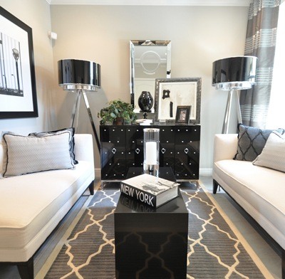
The first model I toured was decorated in shades of black, brown, cream and red, not the typical color palette I’m drawn to because black and red together are tricky, but I have to give these home stagers props for pulling off a few wow factor rooms.
First, this family room in cream and brown with pops of red and black. That graphic rug completely makes the space, and I love the mixture of large scale and small scale pattern on the pillows, with a few solids and a stripe pillow thrown in too. The large scale botanical repeats on the window panels while the trim on the panels plays off the solid red pillows.

Opposite the family room is this kitchen with dark mahogany cabinets. I’m loving the glass front upper cabinets that reach to the ceiling and provide additional storage and display.

Are you drawn to bold wallpapers but nervous about the commitment? Follow this cue and use it in the powder room! It’s the perfect opportunity to add that wow factor in a small space and less expensive too. Can anyone source this wallpaper? Because it’s completely fabulous. A well executed stencil could achieve the same effect.

Upstairs was a nice loft area for lounging and TV viewing. The large scale film reels on the wall are whimsical and fun. A nice medley of fabrics too with red again playing the accent role.

In the master were contemporary furnishings. I rarely think to use black and brown together, but they seem to work here, what do you think? Mismatched nightstands appear again like last week, I like that, and how about that dramatic bolster?

My favorite details are the beams on the ceiling, the red trim on the shade and the ottoman tucked under the Parsons desk.

I show the master bath vanity area because I like how the cabinet doesn’t run the full length of the wall and allows for an étagère instead.

The girl’s room upstairs was very sweet and also sophisticated, with the mirrored demilune nightstands adding a glamorous touch. Is it me, or does the charcoal feel a bit harsh? What would you paint the lower half of those walls? I love the flirty monogram pillow and that red ruffle trim on the shade.

Here’s the one accent I’m completely crazy about, that hobnail lamp! That ain’t your Granny’s hobnail, no ma’am, that is one fresh interpretation in a modern shape, redone in gray glass. Where can I find one?

The charcoal walls look great in the boy’s room. I don’t quite understand the double rod for a single panel, but I do like the red banding.

This was a fun art display coupled with a great red chair and glossy black desk with chrome legs.

The living room was decorated nicely. I have a hard time finding fault with any room with a faux bois rug.

And for some reason, I am very drawn to this set of chairs, I think it might be the chocolate brown leather and chrome base combo.

The next model I toured was styled in very traditional furnishings in shades of olive, tan, cream and black. Here is the living room when you first walk inside. I do like the striped panels and the layered wall frames, and I always love a great bust.

Here is the adjacent dining room. Very nice oversized mirror, but do you think this space deserves a larger scale fixture? I find I’m growing increasingly fond of circular dining tables in formal dining rooms.

The family room has a gorgeous rug and this space planning appeals to me, since the (missing) TV can go either above the mantel or above the console, and the room is open to the kitchen.

Upstairs, a master also done in very traditional furnishings. I’d prefer a modern X- bench at the end of the bed instead of these chairs, but those are some gorgeous dark hardwood floors installed on the diagonal.

Opposite the bed, a favorite accent, this black croc and silver nailhead trim console that had me at hello. Too much black croc can go Vegas quickly, but viva a little touch just like this. Even if you skip the croc, I’m inspired by the use of nailhead trim around the doors and drawers.

Here’s a fun kid’s room with a wallpaper motif that would appeal to many boys.

An office/guest room space with equestrian accents.

The white glass lamp with black shade is to die for, and how sweet is the artwork?

The third and final model was really beautiful, decorated in shades of slate blue and gray, the downstairs filled with white walls and trimmed in molding. The living room is off the entry, I like the boxy velvet chairs.

The kitchen was very pretty with its white cabinets and recycled gray glass countertops.


The family room next to the kitchen had a tailored white sectional, gorgeous, but too impractical for me. I can’t do white unless it’s a slipcover! The navy, tan and white rag rug added a casual and fun vibe.

I like the inset above the mantel here to make room for a flat screen.

This breakfast nook was really nice, hello beautiful window seat and velvet chairs. Are you a fan of those large pulls on the backs or would you forgo them?

Upstairs there were several spaces I liked, the first was the loft. I have gray sectional envy looking at this piece, it’s so tailored and practical too.

Next, the master bedroom in shades of gray and white. Those glossy coffered ceilings are amazing!

Upstairs, a glitzy bedroom with some fun wallpaper and glam mirrors.


Finally, my favorite space in the house, the home office. Oh my yes, I could work here.

Especially with a desk and rug like this one !


Well that’s it for this tour! There’s not a lot of building going on right now other than this project, so I don’t foresee crashing other models anytime soon, but I’m always on the lookout for inspiring designs, camera in hand, so if I do spy some more, I’ll be sure to report back.
Hope you enjoyed it! What was your favorite space?
.

I have been keeping up with Centsational Girl for about a year now (and have forwarded your site to all my girlfriends who are looking for decorating ideas!) and absolutely love everything here. Thanks for inspiring me, Kate! My FAVORITE out of this particular article was the home office as well. I could totally work there, too!!!
Well definately some inspiring rooms in that lot!
May I ask, does ‘demilune’ mean the half round (I was thinking ‘demi’ is ‘half’ or ‘partial’ and ‘lune’ from ‘lunar’ so party round or ‘like the moon’ ie in it’s ‘half phase’)? Because I spotted some cylindrical 3 or 4 drawer solid wood bedside tables once in a display home. I did a *gasp inwards* as I love round dining/coffee tables and was rapt to see ROUND beside full tables with drawers… I asked about them and the rep’s answer was ‘I dunno’ and that was that. I found one pair in the Oxfam shop but they were out of my $ reach. Anyway, so with that in mind I wondered about this ‘demilune’ word. Off to see what Google has to say! :)
The third and final home was the best of them all. Thx for sharing. I’m sooo insprired.
these are fantastic! model staging has definitely stepped it up!
That was a fun way to wake up this morning. I love the hobnail lamp! Would forgo the handles on the backs of the chairs and dig the grey subway tiles in the kitchen.
~Kristin
I’m liking the mirrored nightstands – very luxe!
These photos took my breathe away. Thanks, Kate, for taking us on a tour with you.
I want the lamp too! I’ve been planning on redoing my whole house in gray, so this was a great post for inspiration! I hope one of your readers finds the lamp for us!
I’m not much of a traditional gal, but I ADORE that traditional living room. It manages to look sophisticated and traditional without looking old or outdated. Nice job!
wow…i wish i could move into any of those houses right away, and then put a little of my own spin on everything. sometimes i get tired of the clutter in my house, and wish i could just live in a staged house all day long.
I think my overall favourite is the last home but I’ loving the second dining room and living room….Enjoyed this tour!
Thanks for these lovely tours – always fun to see what stagers are up to :-). I have to agree that the final home overall was my favourite. I love pulls on chairs but am not that fussed about those ones. Re. the charcoal girls room, while it wouldn’t be my first colour choice I think it all would have worked if they had used a graphic floral or bird motif duvet colour a la Dwell studio to pull all the colours together and introduce some more movement. Thanks again!
OOh I love the third house’s kitchen….I would love to wake up every morning and go in there for coffee!!!!!
Wow!!!!!!! I wish I could pack my bags, wait better yet, I’ll need new clothes to be in that house. Kudos to the designer whoever they are. I wish I had a scrap of their talent for home design.
I would forgo the pulls on the back of the chairs though. :) Thanks for sharing. I hope to come back and look again for inspiration.
Jessica
I am loving the boy’s room in charcoal, red and white. The art display is awesome! So very Lego! Any idea where the “lego” looking squares are from? Or any input on how to DIY them?
These rooms are gorgeous! I really enjoy touring model homes. It was nice doing it without having to leave home. Thanks for sharing.
Jane
frugalfineliving.com
Join us on Facebook!
Wow!! THANK YOU for doing this! The pictures are magazine quality and they give me some really great ideas since we’re trying to sell our house.
I love the first house! We toured a model home when we were house hunting a few years ago and it was awesome!!! Can we look forward to more? ;)
Thanks for the amazing eye candy this morning ! I needed some new projects and I see quite a few I would love to do.
I looooove the last house. The colors are beautiful even if all of the white is impractical! I would definitely keep those knobs on the chairs. How cute. And I’m kinda digging that Las Vegas console, too. I just can’t get over how everything has nail head trim these days. I can recall about 6 pieces of furniture in my house as a kid with nail head trim; wonder if my parents still have that stuff somewhere…..Thanks for the tours.
Wow, great post today. I totally enjoyed each of the models but have to say my favorite space was the kitchen in the last model. Glass countertops? love that! Karen
I LOVE the green-ish one. I wonder if you could send me the contact info for the developers so I can call and ask where they got the fabric for those green tone stripe curtains? I have been looking FOREVER for something like that and I can NOT find it anywhere!
The last house is definitely my favorite. I love those framed tennis rackets! I never thought to frame anything sporty except a jersey or a photo, so I love this idea.
My favourite would have to be the second home, but that office in the third house is just too perfect! Thanks for sharing. I have to say I am surprised that you were able to get so many photos, as there are strict “no camera” rules in the show homes in my town.
Oh my, oh my, OH! Thank you so much sharing the model homes with us. I love to go into them just for the inspiration.
I’m absolutely crushing on the home office/guest room in the second model. The only thing I wasn’t crazy about was the odd curtain rings chosen. Other than than, I’m smitten! Perhaps it’s because I’m currently decorating my office/future guest room…;)
My favorite space was the office with the X-shape legs. I *love* placing the desk in the middle of the room.
Who was the builder? It feels like Brookfield. Maybe the builder just used the same decorator.
I don’t know the source on that wallpaper, but the model of our home had something very similar. I’m thinking your faux genius could do a stencil very similar to this!
I love model home number two! Full of inspirational ideas!
Love looking at the models- thanks for going back and then sharing! I like the last house the best except for the pulls on the dining room chairs. Huh? That was just weird. I thought they pulled off the brown and black pretty well in house 1 but I don’t think I’d try it. Seems like it could go really, really wrong in a hurry.
I seriously can’t even say which one was my favorite. After three photos I thought I was going to squeal on that lovely bathroom… but then they kept getting better! Sigh… to have an unlimited expense account and a designer on speed dial… that would be amazing! :)
Ohhhhh.. where oh where is that graphic geometric rug from (in the first living room)?
I love the grey bedroom!! The kitchens are to die for. I’m lusting after granite countertops!!
Wow, These are so awesome. Thank you for taking the time to run around and photo these. If I lived near a place that had staged condos and homes, it would definitely be my new form of entertainment!
My fav is the office rug. I work in my bare feet most times and that would absolutely be like spa walking on warm rocks!!!!
There’s not one picture in this post that I don’t absolutely love. AHHH!
Oh my goodness I am dying over these model homes. I can’t decide which I love better! I’m about to Pin lots of these pics :-)
Love that office, all the rugs are outstanding and the neutral color scheme, yes please! Thanks for sharing all of these.
All the black and grey variations…especially in long narrow spaces amazing. I am always perlexed as to what to do with awkward small rectangular shaped rooms. Very inspirational!
I love the 3rd house’s office but I am always annoyed when designers float desks. It’s a great look but unless they worked with the builder to put sockets into the floor, you can’t have a lamp or plug in your laptop. Grrrrrr.
I’ll take #3 please. But I imagine, *sigh*, that my kids, dog, cat and hubby would make quick work of such spartan luxury. The doorknockers on the chairs I do not love, but I recall a TV designer (was is Candice Olson?) saying they were so practical for upholstered chairs so people could use the pull to move the chair and not put their grubby hands on the fabric.
that hobnail lamp = <3 !
ashley
I must say I am LOVING those giant film reels. What a great decor idea for a serious film buff or a theater room. Although I personally would not want them in my living room! :)
Great point Courtney, where would the plugs all go? And thanks Tori for the reminder about the chair pulls, that certainly makes sense!
Kate
These homes are amazing! My favourite would have to be the kitchen with the white cabinets and recycled gray counter tops. We are planning on renovating our 70’s kitchen in the next year and I welcome the ideas!
Great post! Thanks for all the inspiration!
Ah-mazing. I want to live in those houses! The kitchens are unbelievable! Thanks for sharing!
LOVE the boys room. THANK YOU. I have been trying to talk my boys into grey walls and red/black. They liked this – we printed it off and are off to do some shopping.
♥ the third one best!
Sorry I missed the link party for the garden stuff ( life happens)…but here’s a late link anyway :)
http://sharingourpath.blogspot.com/2011/07/we-are-nearing-home-stretch-of-front.html
Anyone know where the circle rug is from??
Words cannot express my love for this decor/style!!! Makes my heart race!!! Seriously!
This makes me want to go look at display houses! I used to do that when I was a teenager! Other kids were out parting with friends, but my sister and I were driving around looking at display homes! LOL!
Love that last house and I’m thinking of doing something like that last home office since I’ll start working from home next month. Anyone know who makes that faboulous gray sectional? Thanks for the tour Kate!
What a wonderful variety! I really liked your article. I too would have chosen something gentler to cover the lower portion of wall in the young girl’s room. That charcoal seems so masculine–almost like a banker’s office. I’m guessing going with a darker version of the tawny color above it would be equally eye catching without altering the final feel for the girl’s room. And I LOVE her night tables! So chic and charming!
Thanks for sharing!
Rose
The blue velvet chairs in the third model home are GORG! I thought the pulls were interesting and not something you see every day but if they don’t serve a purpose for me then I would probably get rid of them. Thanks for scouting out these great designs.
How could you pick a favorite space?! LOVE them all! Although the last 2 are probably my fav- love all the nail head trim!!
Gosh, I love these! I love the first set the best, that kitchen is probably my ultimate favorite.
I really want to do that to my toilet as well, put up some wallpaper or stripes. I think its the room in the house where you should throw in some unexpected fun and personality. Stunning photos thanks for sharing.
Stunning..All of the photos are beautiful..How could you possibly pick a favorite..Have a great week..
Janet
Oooo’s and aaaa’s for the last one. Matt and Sherry need that dog statue (young house love) they broke theirs! I’m going back to look at the last one again! Thanks for the tours!
I want that nubby rug!
Love model 3 – especially the kitchen. I have white cabinet envy. Regarding the office rug, I saw something very similar at West Elm called the Pebble Rug. It felt great on my feet. http://www.westelm.com/products/pebble-rug-r718/?pkey=crugs-flooring
Nice to see model homes, I think you get great ideas from it for your own home and also gets the creative juices going to do a project. I also have a bunch of photos of model homes out here in AZ and will post them so people can see some southwest decor.
Great post! When we lived in Texas many years ago, I used to visit model homes often — and it’s still a favorite pasttime when back visiting family. Sadly, we have NONE in my area, so your post was a real treat! Those gray walls? Definitely too harsh a color for such a “soft” room. And would I forego the pulls on the chairs? Forego is too calm a word — I would GET RID OF THEM. What were they thinking? :-)
I like the last house best. So beautiful. Although I would have liked to see some pops of colour somewhere. Agree that the charcoal walls in the girl’s room are too harsh. And I wasn’t keen on the pulls on those dining room chairs. The sectional in the upper room is awesome for that space. I love sectionals, but one wouldn’t work in our current living room.
Thanks for sharing Kate.
Thanks for the great eye candy! Loving all of those lamps you pointed out. And I always love a big white kitchen.
I love touring homes- thanks for including us! Yes, the gray is too harsh for a girl’s room- maybe if they added a stencil to soften it up a bit. As for the handles on the chairs- difinitely different- I suppose they would be handy for a towel if you are a really messy eater (maybe just had dental work and mouth is still numb?).
I love the way red is infused in every room of the first house, but then again, red is my color, and I have a lot of brown and black with red accents in my living and kitchen area. Now, I am thinking about adding some red accents to the rest of my rooms! I am not a fan of the knobs on the blue chairs, however, I think if they were on a smaller scale, hmm, I think they have a good idea, its just too much. I agree with SheilaG, I think a stencil might soften the harsh gray walls in the sweet girls room. I also looove the nubby rug, and the good looking desk that sits on it.
Found the mirrored nightstand at ZGallerie for $699 – love it!: http://www.zgallerie.com/p-10503-demilune-mirrored-chest.aspx. Thanks for the photos. Very inspiring!
So much fun, I adore visiting new home models, though haven’t done so in awhile, can’t be tempted! Love the powder bathroom, you are right, a perfect place to go for it! Janell
Love these pictures and inspiration! I think I like the concept of pulls on the back of chairs, but not these big chairs. How about pulls on simpler, wood dinning room chairs. Smaller sized pulls would be nicer. Think what you could do with them… Lightly slipcover the chair in fabric knotted through the pull. Add a holiday arrangement tied on… think ribbons, bows, flowers in sconces. Hmmm…
Great inspiration! Does anyone know what type of stone the kitchen backsplash is in the third model? I have been looking for something like it for my own kitchen.
Thank you again! It’s so fun to see model homes. My fav is the 3rd, but I’d take any of them :) My house is needing an upgrade of style so it’s great to get ideas. Thanks Kate!
I agree, the pulls on the chair look dangerous. I’d probably bump into them and bruise myself. I would definitely be removing those before use.
Oh I hate, hate, hate those pulls on the chairs. They elicited an unexpected “yuck!” from my mouth that I surprised even myself with how much I dislike them!
Everything else, though: gorge!
Wow. What great ideas! I LOVE the red bolster in the master bedroom . . . not too sure about those beamed ceilings, though. They feel kinda heavy (even though they’re white) for the light, crisp room. Maybe you had to be there to appreciate them?
As for the charcoal little girl’s room . . . hmmmm. It definitely needs to be softer. A warmer color (one of the more brown tones used elsewhere would be great), or more ruffles & sheers on the bed & window . . . some pillows in the same barely-brown velvet as the living room couch, or warm-toned wood (like the master bath vanity) would do the trick, I think. I do love that bedspread, though, with the long skirt.
And those boxy, blue velvet chairs in the last model (which is my fave, btw). They had me at “Hel-lo . . . ” Love them!
I feel like these are Beazer houses! They look an awful lot like the ones that are for sale right by our house here in TN. I bet they decorate similarly all over the country. Very fun! I’ve always thought that would be such a fabulous job!
So much fun crashing model homes. Thanks for the tour! I’m a stager and really appreciate “model homes” especially when they pour in the details. I can tell this staging was not cheap, I gather (hence CA). What company staged these? I am a lover of grey…really diggin the micro metallic wallpaper!! Who has a source on that?! Yes please….want it…now!
I like pulls on some chairs, but the pulls on those chairs look like pierced nipples. It’s not a good thing. Love the pillows (West Elm, I think?) on that gray sectional in the last home.
I like the cohesive design throughout both models, but that red accent in every room of the first one would just kill me. I hate red. Normally I would say I’m okay with it as an accent, but not in every room. Yellow has the same effect on me. Don’t know why, I guess that’s why they call it personal preference.
Loved this post. I am smiling from ear to ear. The rooms are gorgeous. Keep ’em coming!
I like a lot of design aspects of them all. But if you really look, the way they have the furniture arranged isn’t functional for everyday. The first brown and red living room or family room, how in the heck are you to watch the tv? With your head turned? LOL
I like when kitchen cabinets go to the ceiling. The master bedroom coffered ceiling? To die for!
I have those over sized movie reels in our home, they are super cool.
Not a fan of the one bathroom not having the counters going full wall, I know you were, but I see it being a design dilemma for most home owners.
Thanks for taking us on another model home tour, I LOVE it.
I love going through model homes and do it as often as possible. This is just as great. Thanks for the great pictures and inspiration!
Ok, I wasn’t going to post this bc it is so ridiculously OCD but I looked at the pictures again and it’s driving me batty!! Who placed the rugs? The first rug not centered under the couches. It may be the camera angle but the traditional master looks like the rug and the headboard is off center. And finally I would have moved that green and brown rug out some. Hard to say for sure since I can’t see where it is under the couch. The first one is the worst. I love the rug but it needs a scoot! I feel so much better…. ;)
LOVE the bar stools on the last model!
Love theh paint colors in the 3rd model!
Wow, great decor! I love all the rugs that were selected and the simplicity of the style! Like the pulls on the chairs-different…
those are GORGEOUS townhomes! The townhomes where I live do not look like that haha.I love the decor of the third home the best, very beautiful.
Also, you take such professional looking pictures, are you into photography?
i really like the faux bois rug room.
I’d love to know if the tailored comforter for the bed in equestrian was custom or where to purchase one! I’m working a redecorating my office/guest room. That would be perfect!
Hi Michelle, I suspect it’s custom work, and I haven’t seen anything like it around, but do a search for tailored daybed comfortors, something might pop up!
Kate