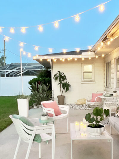
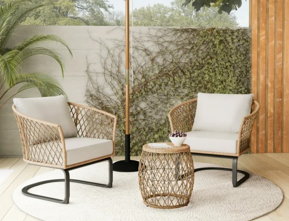
Choosing Paint Colors for Walls (the Easy Way)

January 27th, 2012

As one of the bloggers over at My Colortopia, I get to answer inquiries and write articles about choosing color for the home, which really is one of my most favorite topics in the universe ever.  They asked me to write about my method for choosing paint color for walls so I’m going to share the easiest way! 

When you’re about to paint your walls something other than white, I’m a firm believer in starting with something that will actually live in the space as a source of inspiration.  It can be a decorative object, a textile, something organic, a print or piece of art – anything you love that inspires you. Once you find that thing or that fabric, the easiest way to choose a paint color for the walls is to use that source of inspiration as your starting point. 

In my own master bedroom, I wanted a soothing gray with a hint of blue on the walls, so when I repainted it last year, I pulled my color from this Ikat toss pillow.

kates bedroom ikat pillow on sofa


Fabric or artwork is always a great place to start, but it really can be anything that you use as your jumping off point.  How about the pattern on this loose tea canister?  Your wall color can be inspired by an object just like this. Imagine medium gray walls with vibrant coral or tangerine and spa blue accents, gorgeous!

tea cannister paint swatches

To see a ton of inspiring color palettes, be sure to visit one of my favorite sources Design Seeds – a blog all about pulling color inspiration from both organic and tangible objects.  Also, be sure to check out the My Image Inspiration Tool – upload an image and palette will be generated for you!

Here’s another fabric example. I love this Panama Wave fabric from the Waverly Spring 2012 line (soon to be released).  This vibrant print would be wonderful in a craft room, living room, home office, or teen room.  If you used this fabric as inspiration, say for the window panels or toss pillows or to line the back of cabinets, it’s easy to go right to a paint swatch and pull a soft lemongrass or green color – a paler version of the wave – out of the fabric swatch to use on the walls.

choose paint color from fabric


Or take this medallion print pillow cover with a fabulous motif in various shades of blue. Use it as your jumping off point to search for a deep indigo for dramatic bedroom walls.  

old world blue paint blue fabric


Not only can you pull your wall color out of your inspiration swatch, you can decorate an entire room around a great patterned textile. I found this inexpensive toss pillow at Target, I loved it’s inky blue, cream, and spa blue palette.  A great pattern like this can easily become the theme for the whole space!  Add a gray upholstered headboard, crisp hotel bed linens, white nightstand and trim, a complementary rug and a few more accessories, and you’d have an elegant and enveloping bedroom with this deep indigo blue color on the walls. 

ink blue and white bedroom

Leyland Armless Chair in French Ticking Blue; Sassy Ceramic Table Lamp; Arley Mirror; Medallion Pillow by Target; Old World Blue Paint by Glidden; Carleen Indigo Rug; Bowfront Bedside Chest by Malibu Loft; Greek Key Duvet, Williams-Sonoma.


Two rules of thumb I follow when choosing paint color for walls.

1) Keep in mind you always want to test a 2 to 3 foot sample on the wall before buying a gallon of paint from just looking at a swatch. A few extra dollars spent on samples will allow you the opportunity to see the color on your walls in the changing light to decide if it’s too dark, too light, too intense, too blah, etc.

2) Lean towards a “muddier” less saturated version of the color for the walls. I’ve found that colors with a hint of gray or umber as an undertone look much better on the walls than their more saturated cousins which can often be too vibrant and jarring.

swirl

Now for some weekend fun!  The team behind My Colortopia put together this  interactive quiz for all of you.  Want to know the best color scheme that fits your personality and lifestyle?   Test out this My Life My Colors quiz!

(Visit the site to participate)


Mine were pretty close, except for a peachy color thrown in as a suggestion.  What do you think of your results?  Were they accurate?  Have fun discovering the recommended palette for you! 

Wishing you all a fantastic weekend!

xo,

kate signature image


** I have partnered with Glidden/ Akzo Nobel Paints to participate in the My Colortopia program but the thoughts and opinions expressed are my own.

.

Print Friendly
Share

Hometown Paper

January 26th, 2012

I’ve written before about my hometown of Petaluma in Sonoma County, California.  It’s a really wonderful place to live, filled with antique shops, close to the coast and San Francisco, and we’re in the Wine Country too. A few days ago I was interviewed for an article in the local paper, and woke up this morning to see the feature!

kate riley argus courier

Greetings to my fellow Petalumans who are reading this today!  You can learn more about me here and browse the Project Gallery and Style Files for plenty of inspiration. Perhaps I’ll see you around town (I’m the gal with the paint in her hair). Thanks so much Lynn (and the Argus Courier) for the great article!

.

Print Friendly
Share

DIY: Lacquer Lookalikes

January 25th, 2012

It has been said to me by my mate on more than one occasion that when it comes to decor I have champagne taste on a beer budget. You’ll get no denial from me. I’ve long been in love with lacquer nesting boxes like these and these ~ they are such glamorous little vessels for storing everything small from jewelry to keepsakes. I happen to find them completely irresistible, but the problem is they’re pricey, up to $80 a box (or more!) for the designer versions.

ooh la lacquer boxes


So last weekend I decided to do my thang  and mimic the look of these beauties with a few supplies from the craft store.

lacquer lookalikes before and after


diy lacquer lookalike nesting boxes

To make these yourself, here’s what you’ll need: wood jewelry boxes from craft store, small Phillips head screwdriver, paint colors of choice, wood filler, painter’s tape,  medium and small paintbrushes, fine sanding wedge, high gloss coating.


Read the rest of this entry »

Pin It
Print Friendly
Share

Picnik Aftermath + Making Pinteresting Labels

January 24th, 2012

I’ve had two cups of coffee so brace yourselves, this is a long post about photo editing, Picnik, and making labels for Pinterest. My friends, Google dropped a bomb on us over the weekend.  Perhaps you’ve heard, but according to their blog, Picnik, one of the best and most user friendly sites for online photo editing is closing on April 19th.

Deep breath people, deep breath.

Truth is, I’m upset like so many and there are hundreds (maybe over a thousand now) of disappointed and angry comments.  Picnik is/was so great for an easy photo tweak, I loved the Collages and Effects, and I used it to quickly make labels for Pinterest with the Basic Shapes tool.  Some of the basic Picnik tools have been moved to a Creative Kit on Google+ but after visiting, it’s really not the same thing. It seems this is Google’s way of forcing people to join their social network by transferring this popular program over to lure people over to Google+.

Hopefully they’ll reconsider, but let’s assume what’s done is done. What are we to do? What about kids who can’t join or those who don’t want to bother with Google+? We Picnik lovers are now mourning and seeking alternatives. What are our choices?

bye bye picnik

I’ve been hunting around for one over the last few days. It basically comes down to a few other online sites, upping your game by purchasing and learning to use Photoshop Elements, or turning to close but free equivalents like GIMP, Splash Up, and Pixlr.  My brother is slowly teaching me the ins and outs of Elements – I’m just amazed at what it can do.  I’m getting more proficient, but there is definitely a learning curve.  Often my eyes glaze over when working with Elements, which is why I’m excited Layla is planning some tutorials in the near future.

For us Picnik fans, sadly, there’s no one program that does exactly everything I or we want to do as quickly and easily as Picnik.  iPiccy is the most Picnik-like it its layout and user friendliness and has some of the same fancy tools we’ve become accustomed to (Clone Tool, Sketch Tool, and also a Painter tool), but lacks the sophisticated Frames, Borders, Collages, Shows, or Stickers (Geometric, Speech Bubbles, etc.) we loved over at Picnik.  iPiccy likes feedback, so feel free to suggest any Picnik like tools to them.

Fotoflexer has a few Photoshop like tools that are available like the ability to use Layers and Scissors (similar to the Lasso tool), Paint Bucket, Pencil, and Eye Dropper.  There are several fun Effects similar to Picnik and it will Beautify (meaning fix wrinkles like Picnik’s Wrinkle Remover) but still not as great as Picnik.  (Thanks Jen for letting me know about this one).

Pixlr Express is another online editor which offers the ability to make some quick adjustments, and also has some fun Effects and Overlays. They have a Teeth Whitening tool like Picnik, but no other Touch Ups or Stickers and a limited amount of Frames.  Photoshop Express Editor is available as well, and while their basic edit functions are superior to most, they have none of the other fabulous Tools, Effects, etc. offered by Picnik.  I’ve always liked Picasa for a basic photo edit, but again, no fancy Tools or Effects.  And then I checked out Pixenate and LunaPic and gave up due to their ads and the fact they seemed to be not very user friendly.  For two other articles offering helpful tips in the wake of Picnik closing, read the SITS girls post on Photo Editing Sites like Picnik and Susan’s article on 9 Photo Editing Alternatives to Picnik.

I also played with three free Photoshop Elements-like programs, they are GIMP, SplashUp and Pixlr.  GIMP requires you download the software, but it also has Layers, and a good toolbox (Paintbrush, Healing, Bucket, etc).  The nice thing about GIMP is once you download it, you can work without an internet connection.  Splash Up’s layout is also similar to Photoshop Elements, it offers Layers and Tools like EyeDropper, Marker, Eraser, etc.  My favorite was Pixlr, simply because it looks and feels the most like Elements and is completely free so you can work on it anywhere you have internet access. My brother and I played around with it a lot over the weekend and he was pretty impressed.


Read the rest of this entry »

Pin It
Print Friendly
Share

The Quest for the Perfect Robin’s Egg Blue

January 23rd, 2012

I spent this weekend prepping and priming a dresser for a good friend in anticipation of painting it for her daughter’s room.  We’re sprucing up the space and repurposing some furniture and since the walls and daybed are white, I thought it would be absolute perfection if we painted the dresser robin’s egg blue. So off I went in search of the absolute perfect shade. 

I adore this color so much I even use a version of it as a background on the ol’ blog. It’s that blueish with a bit of green and gray shade that in my opinion just makes the world a better place. It’s not turquoise or aqua, but not pastel or too green either.  Kind of airy and watery but not as bright as Tiffany blue, and always so so pretty when done right. I’m a total sucker for anything painted robin’s egg blue.

Like this console.

morgan harrison home buffet

via Morgan Harrison Home


Or these floors.

armelle blog robins nest

via Armelle blog


Read the rest of this entry »

Related Posts with Thumbnails
Print Friendly
Share